Elevating the Bassist's Experience: The Exponent 500 UX Transformation
Redesigning the mobile interface to empower musicians with an intuitive and seamless experience.
Executive Summary
I led the comprehensive UX/UI transformation of the DG Suite for Darkglass Electronics, focusing on the Exponent 500 amplifier. By gathering and applying user insights, I simplified complex workflows and enhanced the interface, resulting in a more intuitive experience that was highly praised by both novice and expert musicians. This redesign not only improved usability but also reinforced Darkglass's reputation for innovation.
Highlights
“I love the pedalboard layout, the new layout make it way easier to see your signal chain and move pedals where you want.”
“I like having the (1-5) banks at the top of the screen instead of the bottom.”
“It worked great!! The new layout is a much needed improvement”
“Many users have been praising the new IR loading design” - DG Customer Support
Role
Sole UX Designer
Framework
Lean UX
Tools Used
Figma | FigJam | Whiteboard | Pen & Paper | Confluence | TestFlight
Platforms
Android | iOS
Context and Background
Overview
The Darkglass Suite
Darkglass Suite (DG Suite) is a software platform that facilitates the setup and configuration of Darkglass devices, including amplifiers, pedals, and combo units, across mobile (iOS, Android) and desktop (MacOS, Windows) platforms.
However, prior to my involvement, the platform lacked a dedicated Product Designer, which resulted in a suboptimal user experience and significant usability challenges
The Exponent 500
The Exponent 500 is a powerful amplifier with multi-effect pedal capabilities when integrated with the Darkglass Suite. However, its advanced features and digital complexity posed significant usability challenges for users, making it difficult to fully leverage its potential.
2 software developers
2 embedded sofware engineers
1 sound and QA engineer
Problem
Customers of Darkglass have expressed significant frustration with the DG Suite, particularly due to its steep learning curve and operational challenges. This dissatisfaction has led some users to sell their Darkglass units, highlighting a critical need for improvement.
The Exponent 500, as the most advanced and complex product within the DG Suite, was identified as a priority for UX enhancement to reduce user frustration, improve usability, and ultimately retain customers.
Task
As the sole UX designer at Darkglass Electronics, my role was to simplify the interaction when using the device in tandem with the app, improving the overall user experience and ensuring that users could seamlessly access and utilize the Exponent 500's full range of functionalities.
Exploration - Detective work
Objective a.k.a why?
This research aimed to uncover key usability issues in the DG Suite when paired with the Exponent 500. These insights shaped my design strategies to make the DG Suite more user-friendly and less frustrating.
User research - Customer Support Insight
Customer Support as the Key Source of User Feedback
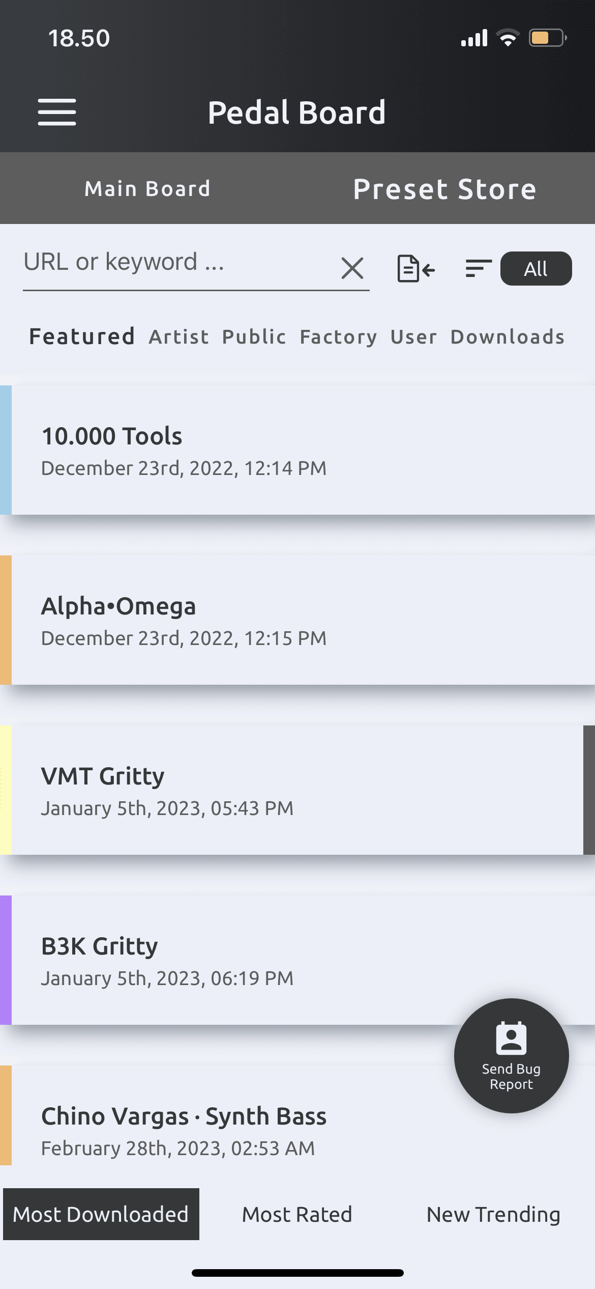
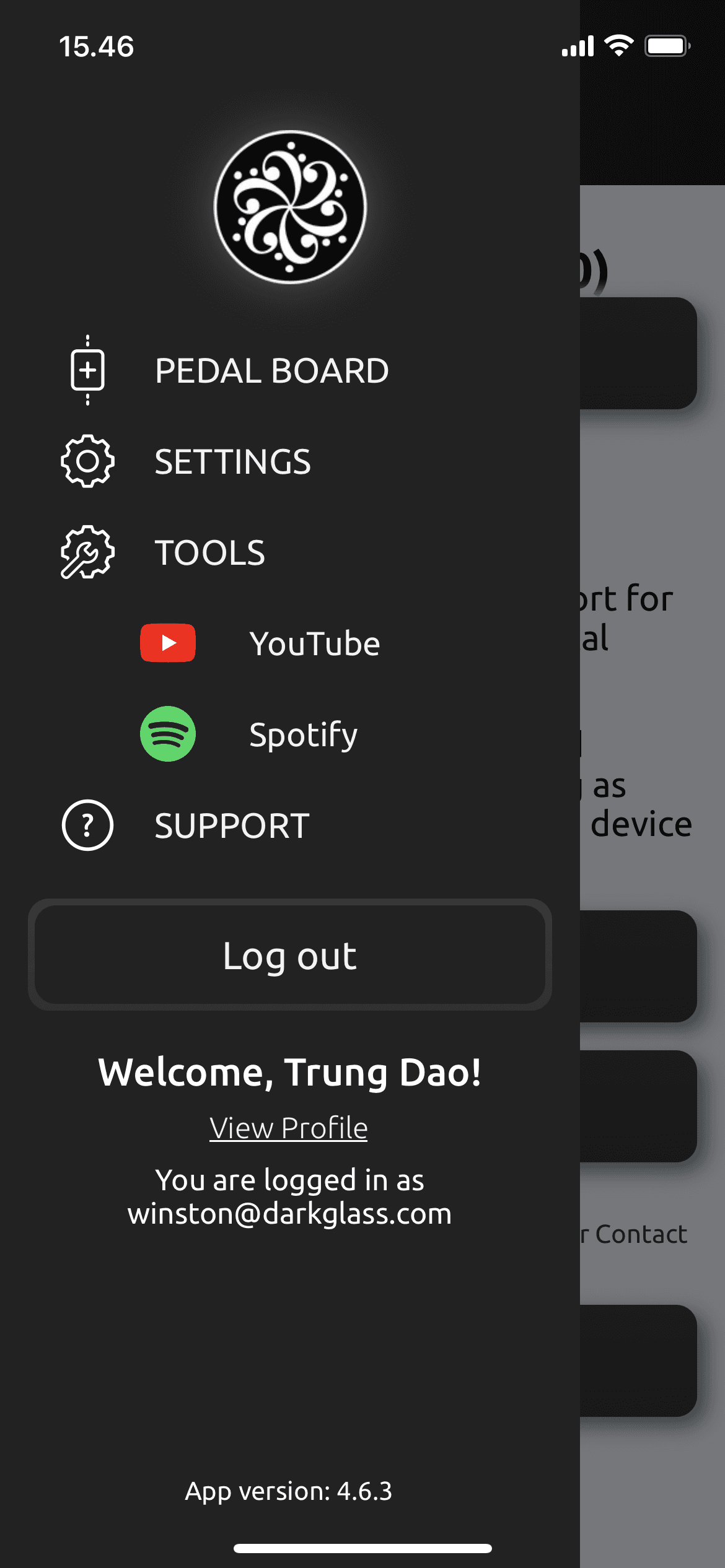
The customer support team at Darkglass often received similar questions about the DG Suite, highlighting some common pain points. They noticed that most issues centered around a few key screens, suggesting that redesigning these could really enhance the user experience.

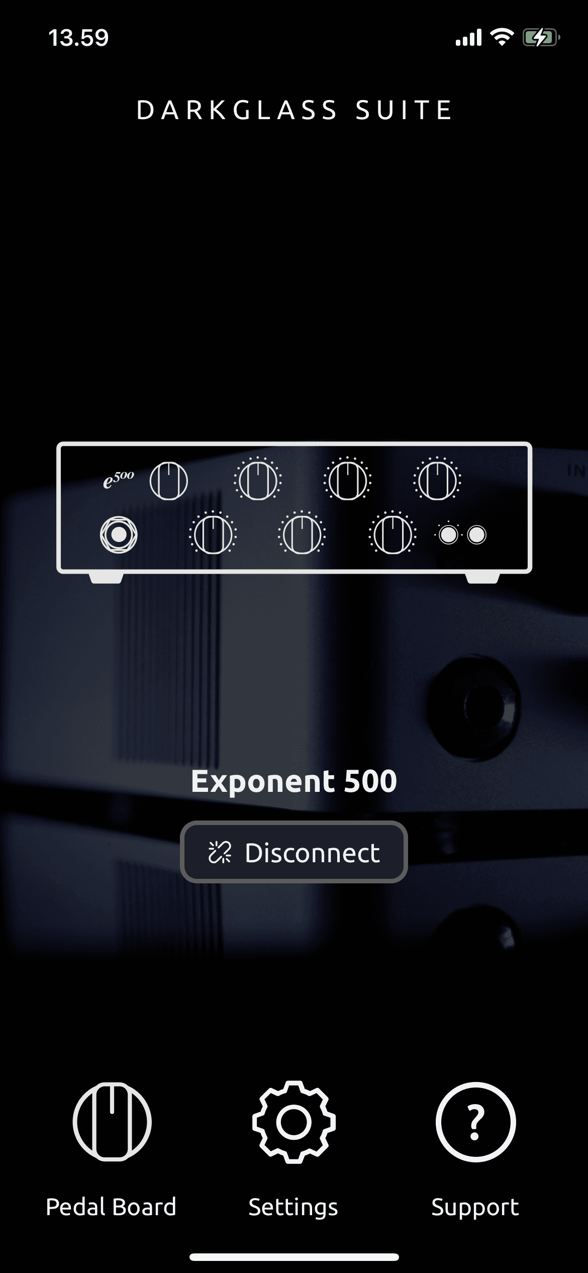
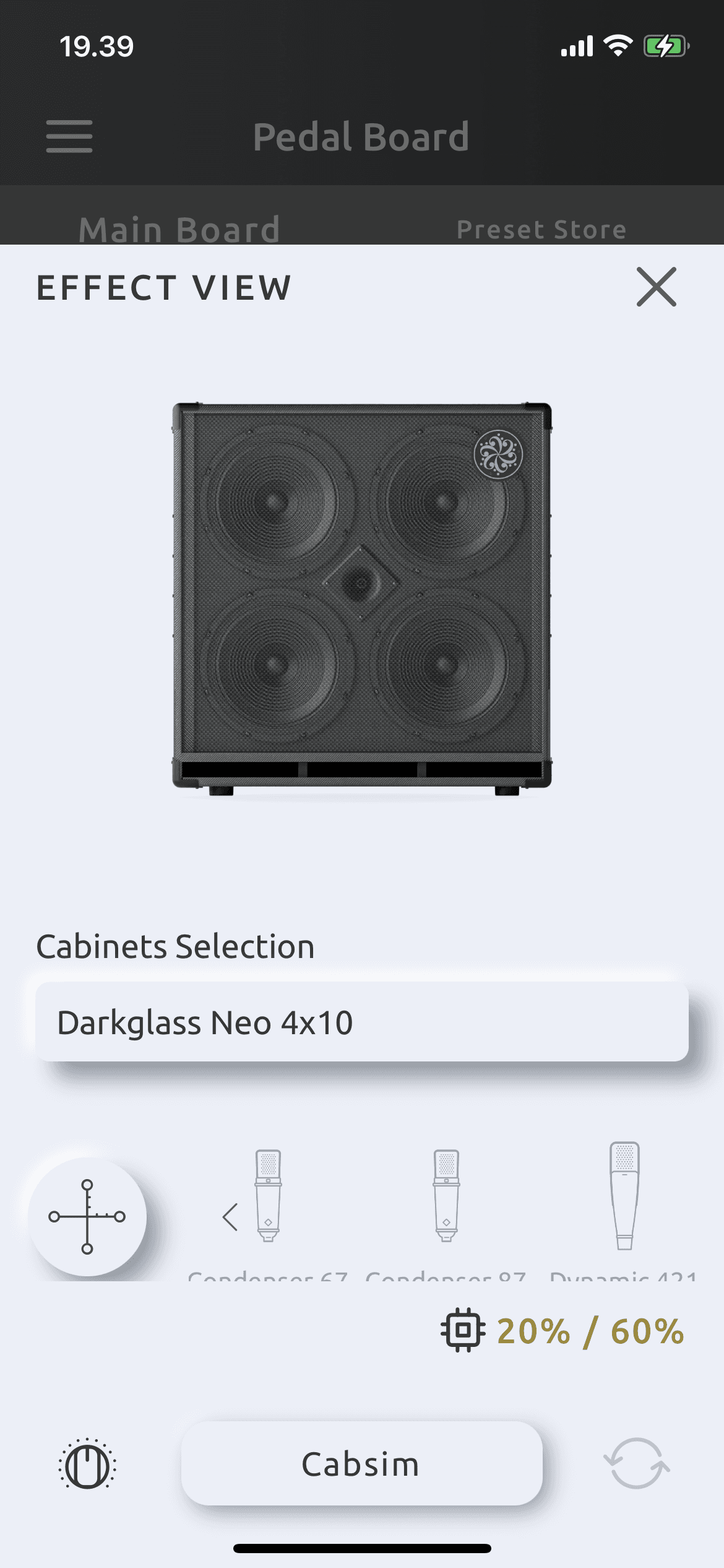
Pseudo main screens where main problems lie
Online Communities and Threads
Researching User Feedback in Online Communities
To get a clearer picture of the challenges users faced, I dove into online communities like Talkbass, the Darkglass User’s Facebook Group, and Reddit, where users shared their experiences. These communities were a goldmine for real-world insights, helping me spot the usability issues users were encountering.
Examples of the first round of searching for “Darkglass Suite” as the keyword
Key findings
Pedal Board UI: Users often felt frustrated by the layout, finding it hard to recognize and use key features.
IR Loading UI: Users found the IR loading process complex and not very intuitive.
User segmentation
Through my research, I identified two main user groups:
Novice players / Casual users
Novice players like to experiment with the Exponent 500 on its own first, and they often look to online forums for inspiration and tips on advanced features.
Experienced players / Power users
Experienced players use the Exponent 500 as a key part of their live setup. They dig into the manual and apply their pedal board know-how to get the most out of the Exponent 500.
General Usability Challenges: Most users agreed that the DG Suite wasn’t very user-friendly and needed a major refresh. Common tasks were often tricky, causing frustration for both novice and experienced users.
Repetitive Usability Issues: Repetitive Usability Issues: A lot of the user questions and complaints were the same, highlighting systemic usability problems. This showed that several screens and processes were overdue for a redesign.
Heuristic Evaluation
Why heuristic evaluation?
With the complexity of the Darkglass Suite and Exponent 500, I needed a quick and effective way to further pinpoint usability challenges, based on the input from Customer Support and user communities.
Heuristic evaluation gave me a structured way to uncover critical pain points, offering insights that directly shaped the redesign.
Evaluation criteria and Grading System
I used Jakob Nielsen’s well-known heuristic principles to evaluate the DG Suite, focusing on key areas like system visibility, user control, error prevention, and interface consistency. Each issue was rated on a scale from 1 to 4, where:
(1) indicated a cosmetic problem,
(2) a minor usability problem,
(3) a major usability problem, and
(4) an imperative usability problem requiring immediate attention.
Findings and Impact on Redesign
The Signal Chain / Pedal board

The lack of confirmation for deletion
The Navigation Evaluation
Grade 4: Alignment with Mobile UX Conventions
Grade 3: Consistency and Standards
Grade 3: Recognition Rather Than Recall
Issues: The navigation design requires users to remember the web-like menu structure rather than recognizing familiar mobile patterns, which increases cognitive load.
Grade 2: Aesthetic and Minimalist Design
Issues: Some screens lacked secondary navigation options and relied too heavily on “tags” and “sorting,” which cluttered the interface and made navigation less straightforward.
Effect and Cabinet Simulation Selection Evaluation
Grade 3: Consistency and Standards
Grade 2: Recognition Rather Than Recall
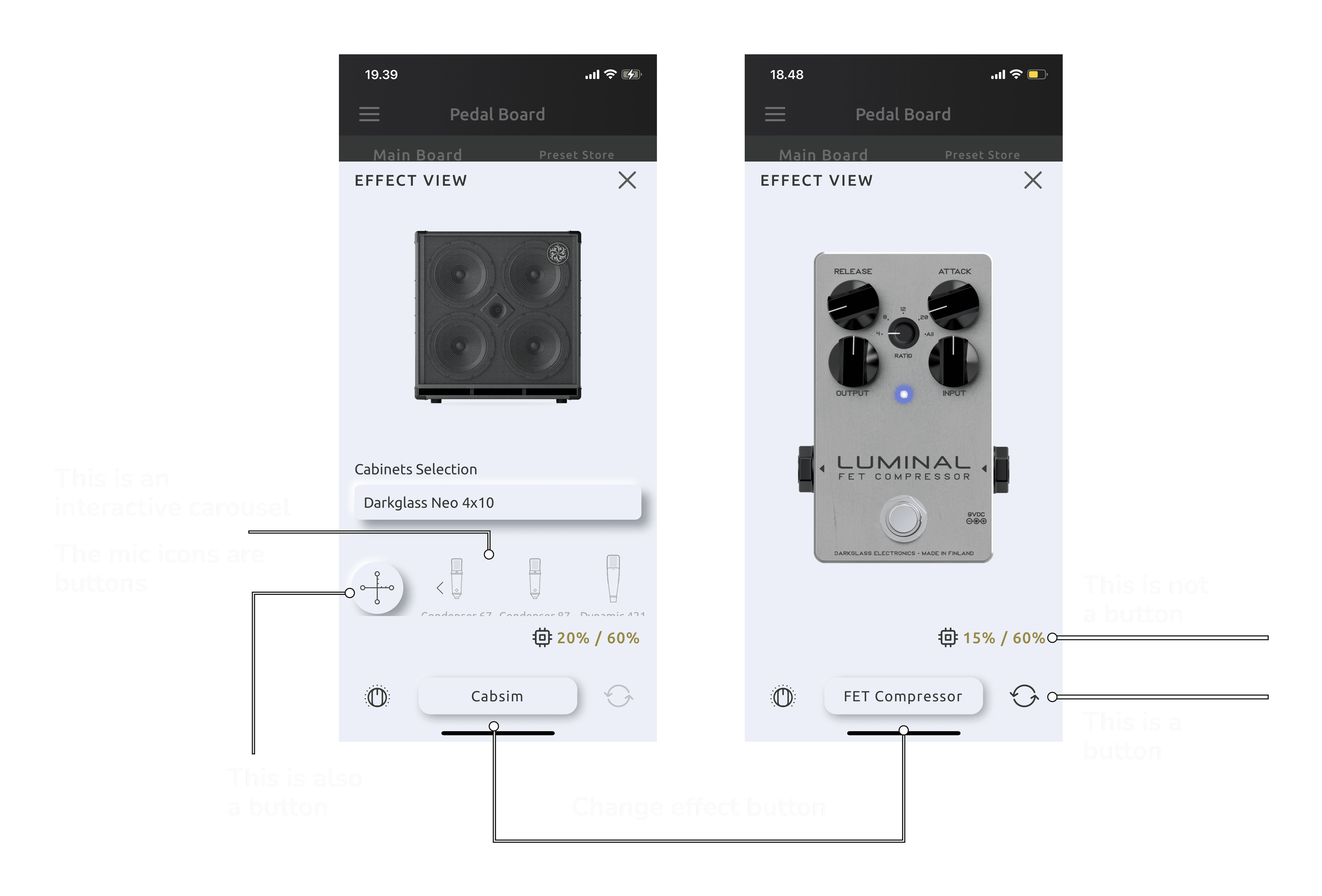
Issues: Users struggled to understand what actions were possible in the Cabsim and effect selection interfaces. The design relied too much on users remembering how to interact, without clear, recognizable cues.
Grade 3: Aesthetic and Minimalist Design
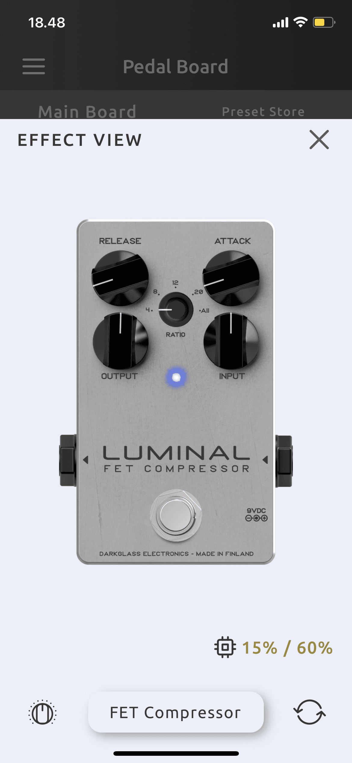
Issues: The effect selection screen lacked visual hierarchy, leading to a cluttered, distracting interface. Users struggled to focus on key elements because of the overwhelming layout.
Exploration Sums Up
What I've Found:
Complex and Unintuitive User Interface: Users, especially those new to the DG Suite, found it tricky to navigate. Key screens like the Pedal Board lacked clear visual cues, making the experience frustrating and prone to errors.
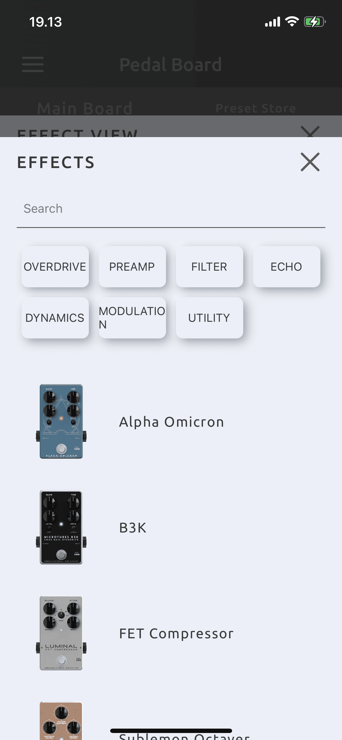
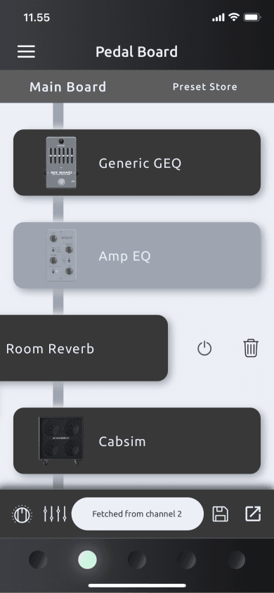
Pedal board and effect view overlay
Disconnect Between Physical Pedals and the App: Users often struggled to integrate their physical pedals with the digital suite, creating a disconnect that made the system feel less cohesive. This was a recurring theme in the feedback received by customer support, signaling a need for improvement.
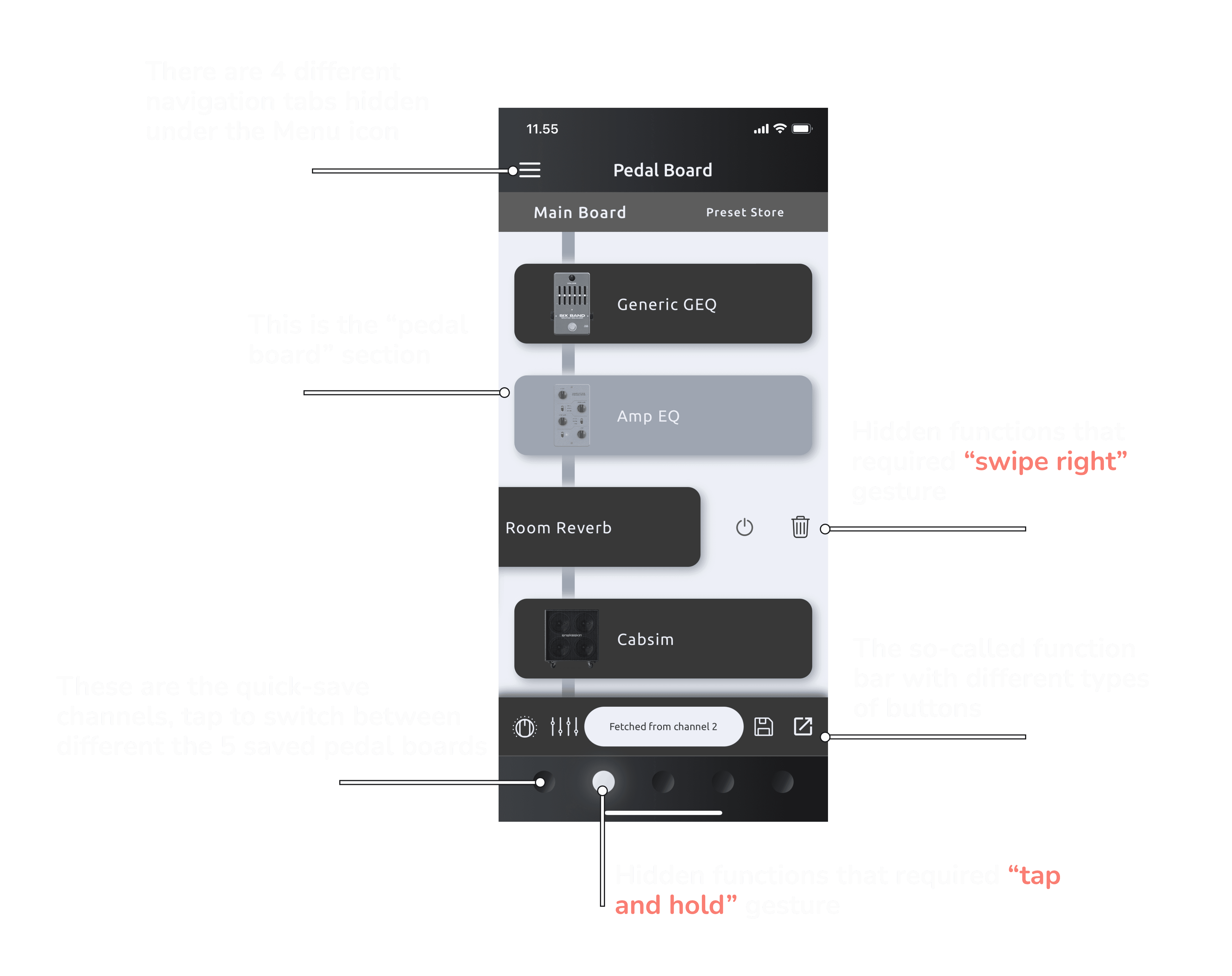
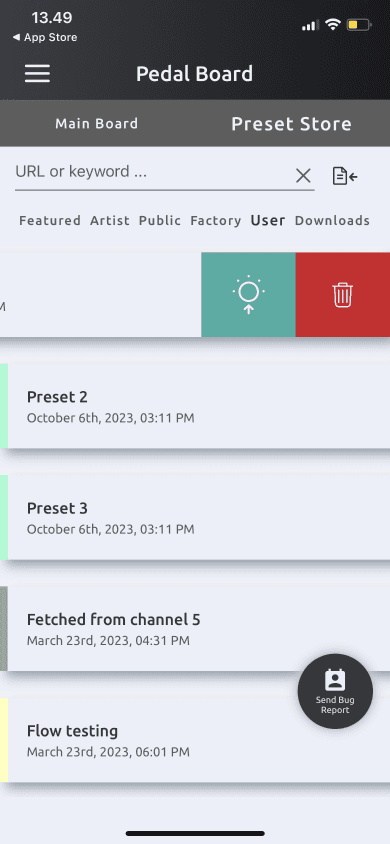
Hidden Gestures and Design Hiccups: The suite relied heavily on hidden gestures (like long touches and swipes) without clear visual hints. This led to confusion, particularly in areas with right-to-left languages, where a simple swipe could cause unexpected issues.
Hidden functionalities
Challenging IR Loading Process: The process of loading Impulse Responses (IR) was a significant pain point, with users finding it unintuitive and cumbersome. This issue was prevalent among both novice and experienced users, indicating a need for a more streamlined and accessible approach.
Lack of In-App Guidance and Documentation: Many users felt lost without in-app assistance and found the user guide lacking. This made it hard to fully explore and enjoy the suite’s more advanced features, like Quick-Pot binding.
How This Shaped the Redesign
It became clear that my focus needed to be on making the interface simpler, adding helpful guidance, and fixing the specific pain points around advanced features like Quick-Pot binding and IR loading. My goal was to create an experience that was not just intuitive and accessible but also enjoyable for both novice and experienced users.
Key Areas To Be Focused On:
Simplifying Key Screens: Reworking the Pedal Board and other important screens to make navigation easier and more intuitive, with a clearer visual hierarchy so users can quickly find what they need.
Visible Gesture Controls: Reducing reliance on hidden gestures by incorporating visible controls and ensuring the app accommodates right-to-left language scripts.
Streamlined Advanced Features: Simplifying the IR loading process and providing clearer instructions for Quick-Pot binding to reduce user frustration
In-App Help as a Future Focus: While we couldn’t address in-app guidance in this phase due to time constraints, it remains a key focus for future updates. This will ensure that users eventually have the support they need directly within the app.
Wrapping Up
This research phase was a treasure trove of insights that guided us in creating a more user-centered DG Suite. By addressing the key usability issues and strategically prioritizing features, the redesigned suite is now more intuitive, efficient, and enjoyable for everyone, with further enhancements on the horizon.
Tackling the Problems
Connecting Research to Action
After pinpointing the key pain points in the DG Suite, I jumped in to create solutions that would genuinely improve the user experience, leveraging the solutions suggested in the Heuristic Evaluation phase.
Simplifying Key Screens
The Navigation As The First Step
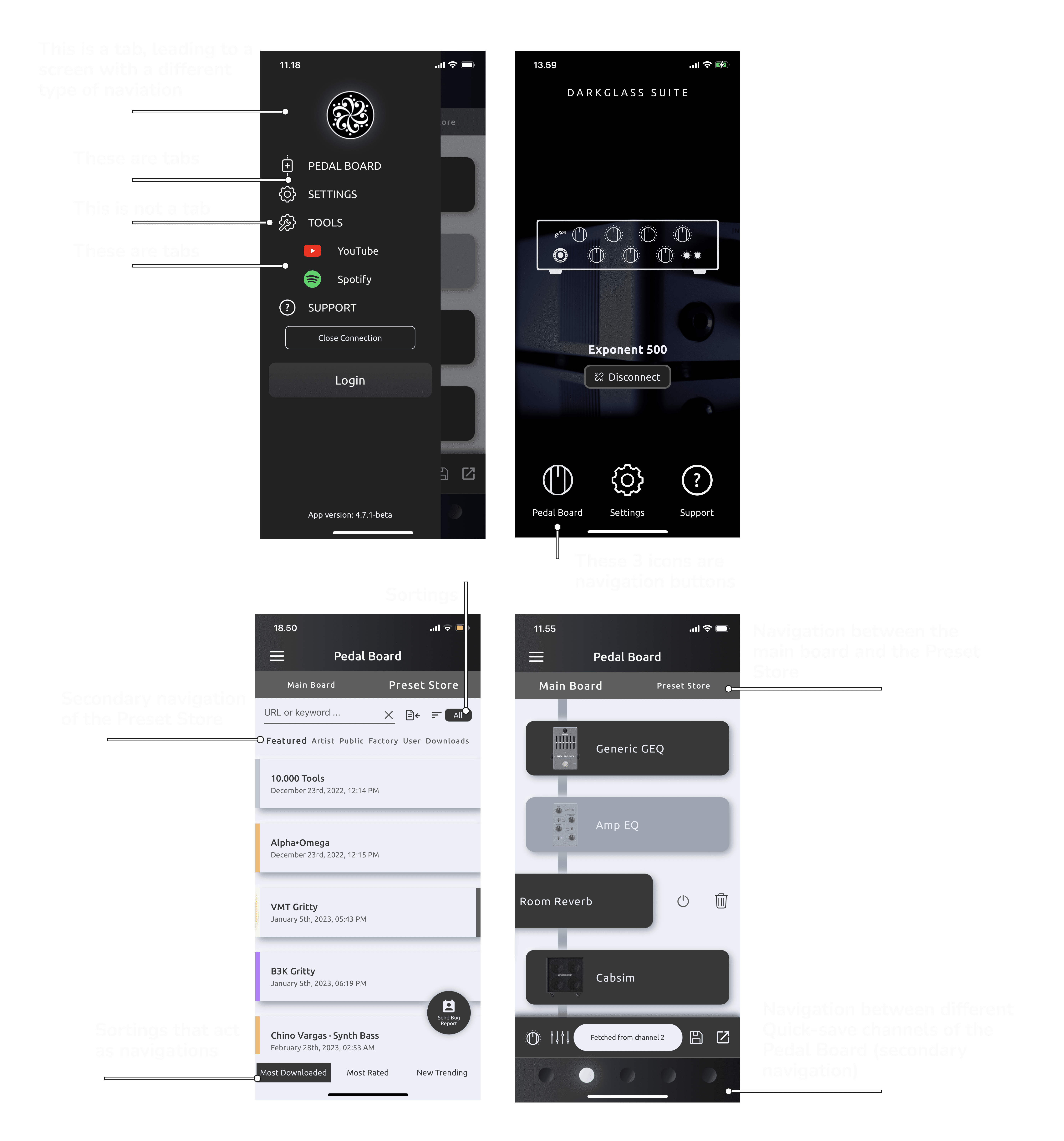
I found that the DG Suite’s navigation lacked consistency and didn’t follow a clear pattern, leading to user frustration—especially with the side menu, which didn’t align with standard mobile app practices.
The Design Decision:
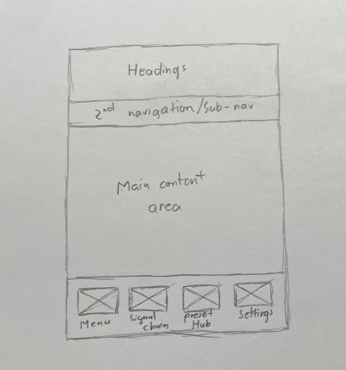
Bottom Navigation Bar: I introduced a bottom navigation bar to make navigation more predictable and user-friendly, ensuring users can easily move between key sections.
Consistent Layouts: I standardized the layout of each screen with a clear focal point, simplifying navigation and reducing cognitive load.
DG Suite - Exponent 500 navigation map redesign, click to enlarge
Redesigned navigation with a bottom bar for easier access to key sections
The Pedal Board Screen
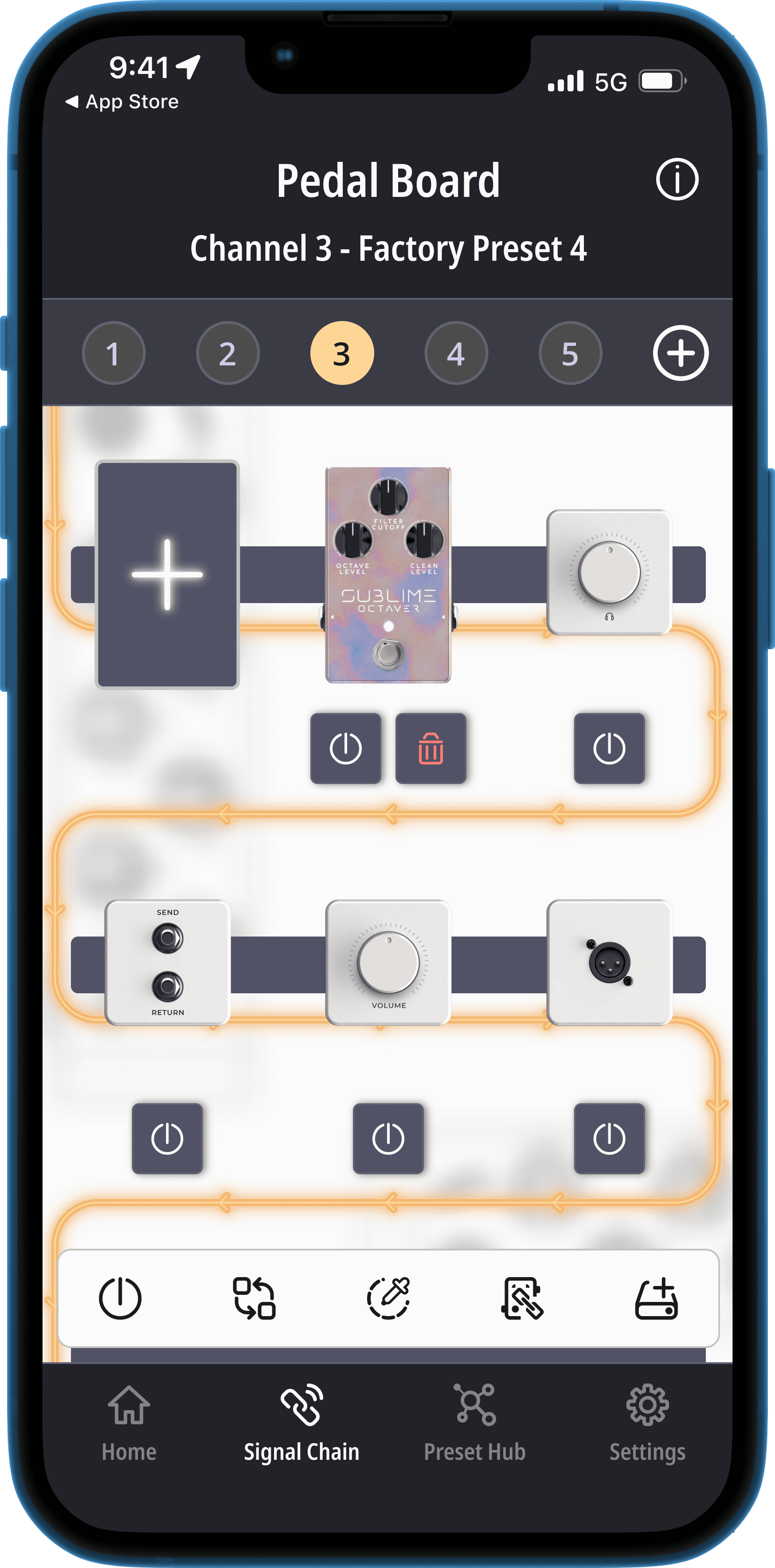
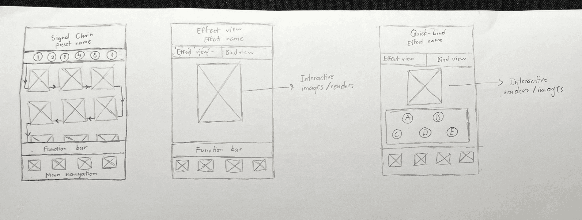
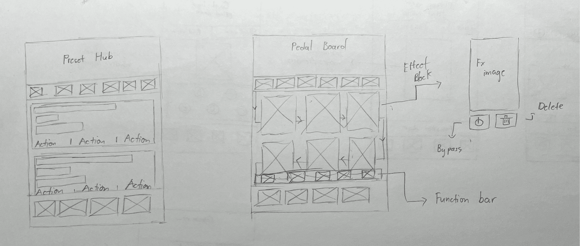
To make the Pedal Board easier to use, I redesigned the layout to look and feel more like a real-life pedal board, complete with a visual signal chain. This approach helps users quickly understand how the "Multi-effects" component of the Exponent 500 works, making the whole experience more intuitive and familiar.
Example of a real life pedal board
Wireframes of the Pedal Board and the Effect view
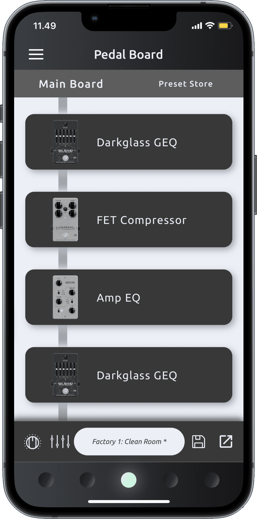
I also replaced the confusing left-to-right swiping action with more straightforward interactions, so users can navigate the interface with ease. Plus, I added a simpler way to rearrange effects on the signal chain, giving users better control while keeping a clear view of their setup.
Before
After
The Effect, Cabsim, and Binding View
Cabsim’s unique features, like specific speaker configurations and microphone setups, were causing confusion and made it challenging due to inconsistent user flows.
Solution: Streamlining the Effect and Cabsim Selection
To resolve this, I restructured the entire user flow to make it more consistent and intuitive across all effect types, including Cabsim.
Effect view and Binding view wireframes
Effect and Binding View Integration
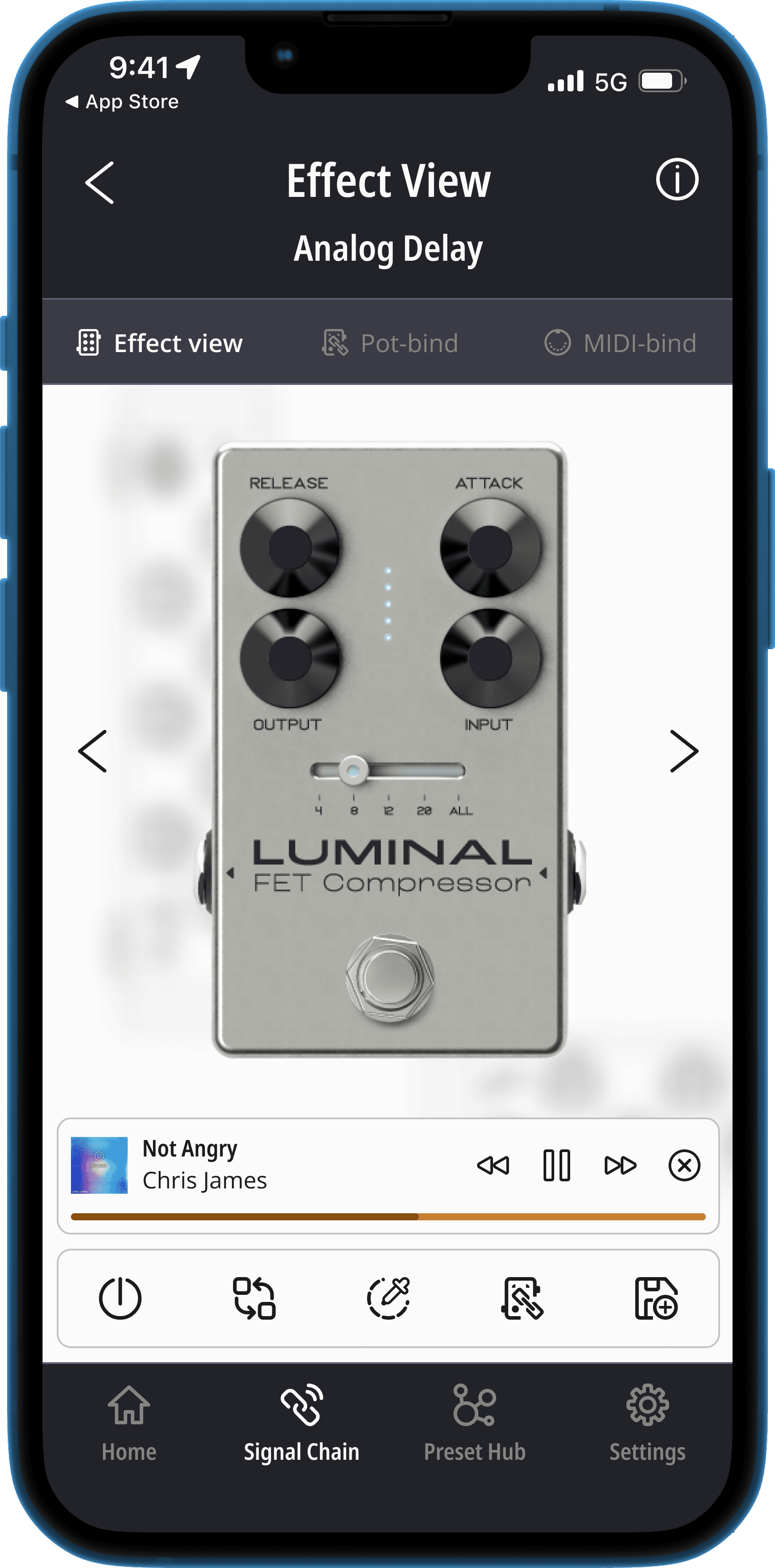
I placed the Effect View and Binding View in the Secondary Navigation, alongside the new MIDI binding feature. This allows users to easily switch between different views and functionalities while configuring an Effect Block.
Effect View before
Effect View and Binding View after
I also redesigned the Cabsim integration within the Pedal Board, ensuring users have a smooth, unified experience when adding or modifying effects.
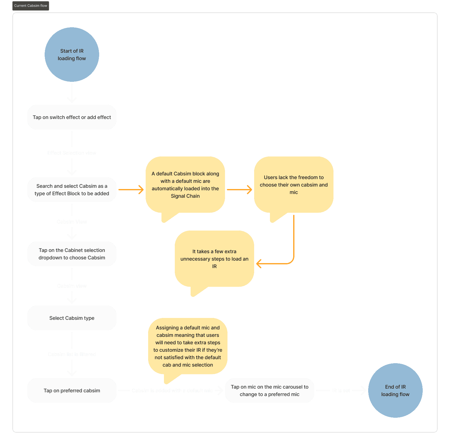
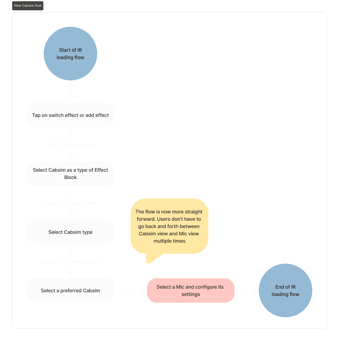
Improving IR Selection Flow:
I identified and addressed usability issues in the IR loading process, making it more straightforward and user-friendly.
Old IR selection user flow
New IR selection user flow
These updates significantly improve the user experience, making it easier for users to navigate and fully utilize Cabsim and other effects in the DG Suite.
Cabsim View before
Cabsim View after
Hidden Gestures and Interface Design Hiccups
Solution: Making Gestures Visible and Improving Interface Design
Approach
To resolve this issue, I focused on reducing the dependence on hidden gestures by integrating visible, intuitive controls that users could easily understand and interact with. I also ensured the interface was fully compatible with right-to-left languages, preventing the unintended actions that were previously causing frustration.
All hidden features and functionalities across the DG Suite are to be placed on an always-on-display Function Bar to accommodate users.
These improvements significantly enhanced the overall usability of the DG Suite, making it more intuitive and accessible to a wider audience. Users who were unfamiliar with hidden gestures, as well as those using right-to-left scripts, now experience a smoother and more predictable interaction with the app.
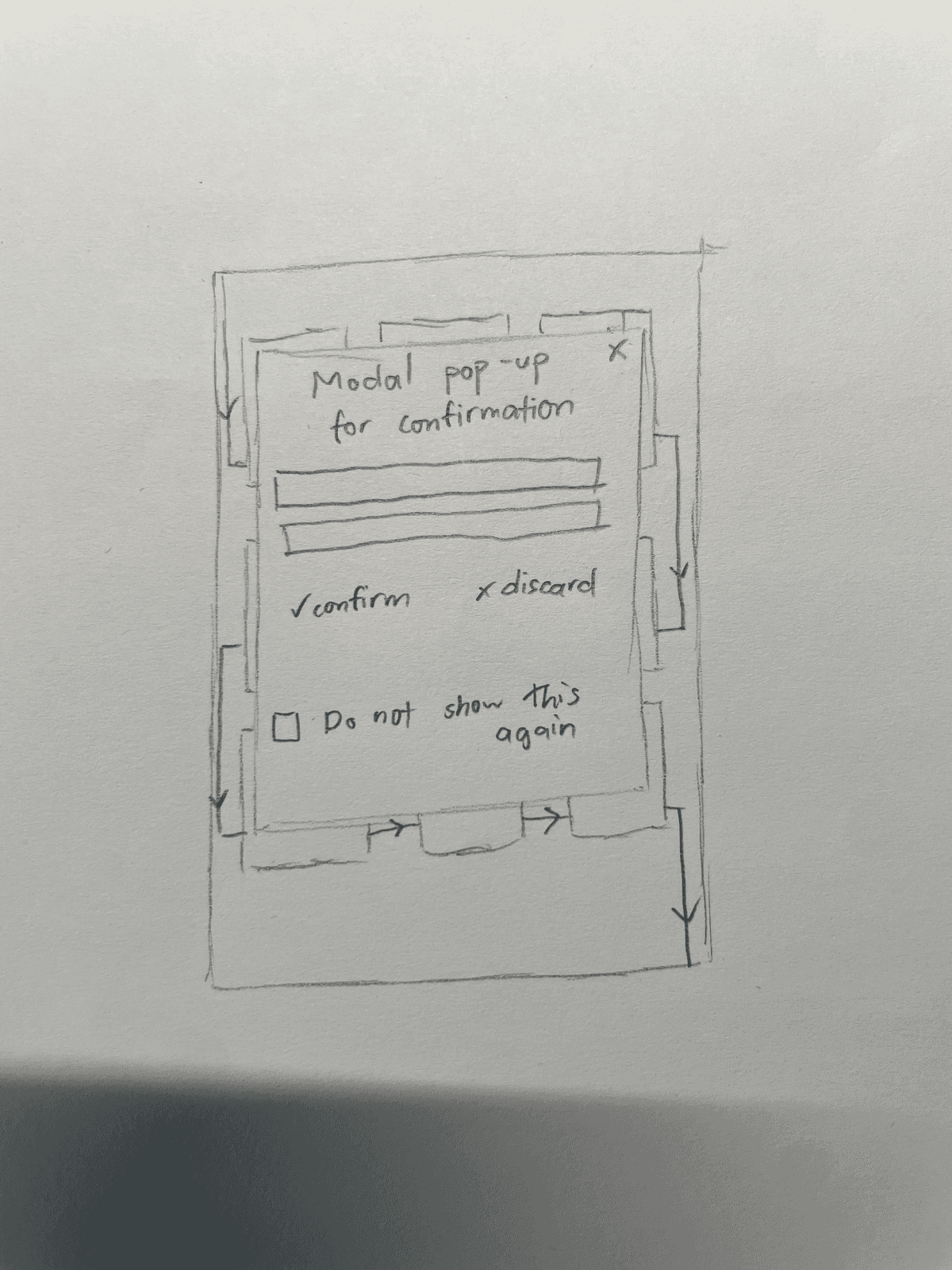
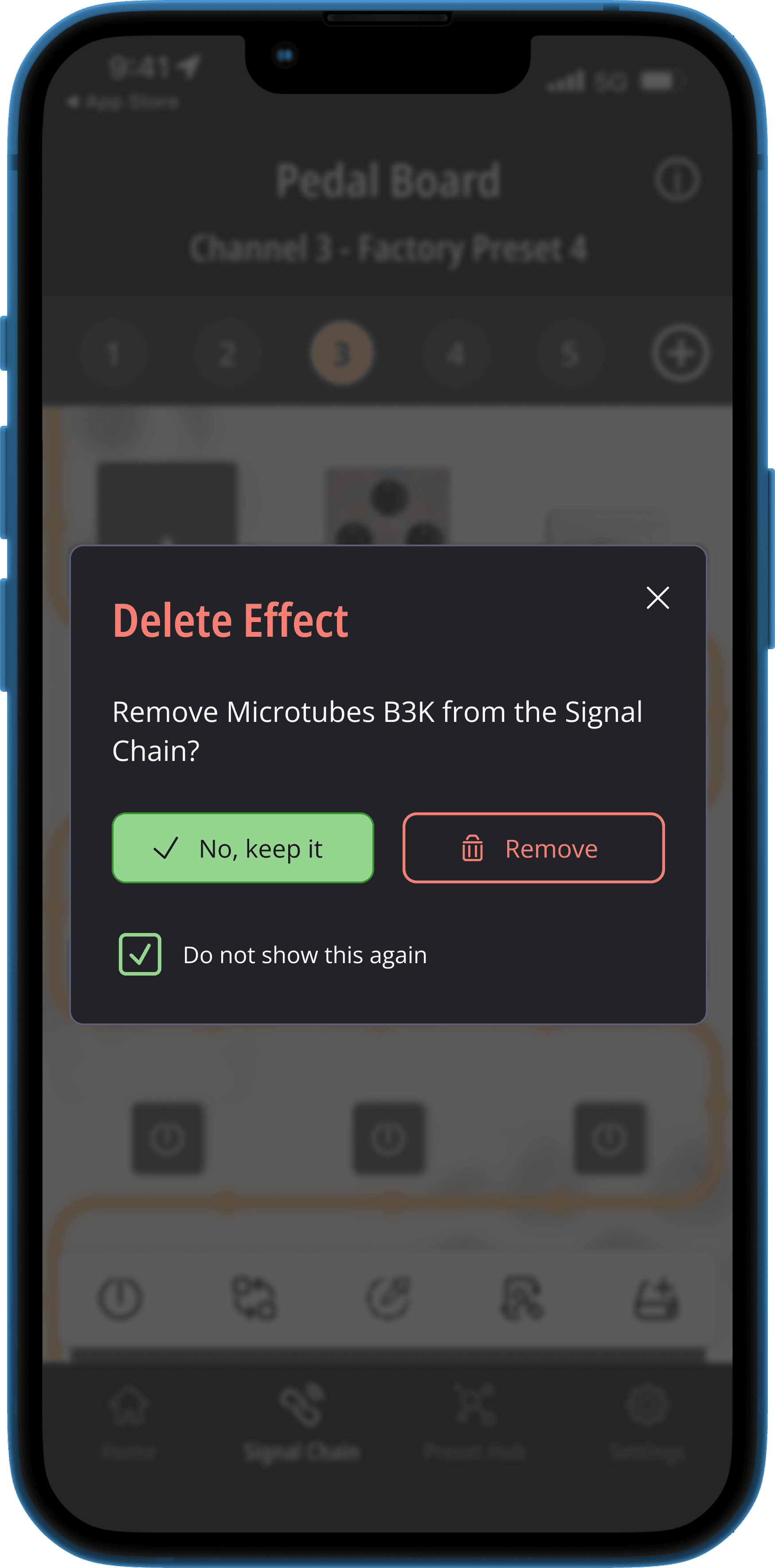
Modal for error prevention
Modal for error prevention
Building on insights from the Heuristic Evaluation, I implemented a confirmation step to prevent users from accidentally deleting an effect block from the pedal board due to its constant visibility. To cater to more experienced users who are confident in their actions, I also added an option to “do not show this again”, which can be easily managed later in the Settings section of the DG Suite - Exponent 500.
Internal testing
With the DG Suite already up and running, we were able to quickly put together a prototype for internal testing. Since the user experience with the DG Suite is so closely tied to the physical Exponent 500 and a bass guitar, we decided that internal testing cycles would be the best way to uncover any issues.
Problems found (Oops! There's a flaw in my design.)
What We Found
During our testing, a few key issues popped up, particularly with the Cabinet Selection and IR selection processes. Users were having a tough time quickly switching between different cabinet simulations when auditioning sounds. Every time they wanted to try out an IR, they had to go through the whole selection process from the beginning, which was frustrating and time-consuming.
What We Needed To Fix
To make things easier for users, the Cabsim View needed to:
Allow quick changes between cabinet simulations
Make microphone configuration fast and simple
Reiteration time
How We Improved It
Realizing the first version of the Cabsim View wasn’t quite hitting the mark, I went back to the drawing board and made some key changes to address the issues we found during testing. The goal was to streamline the process and make it more intuitive.
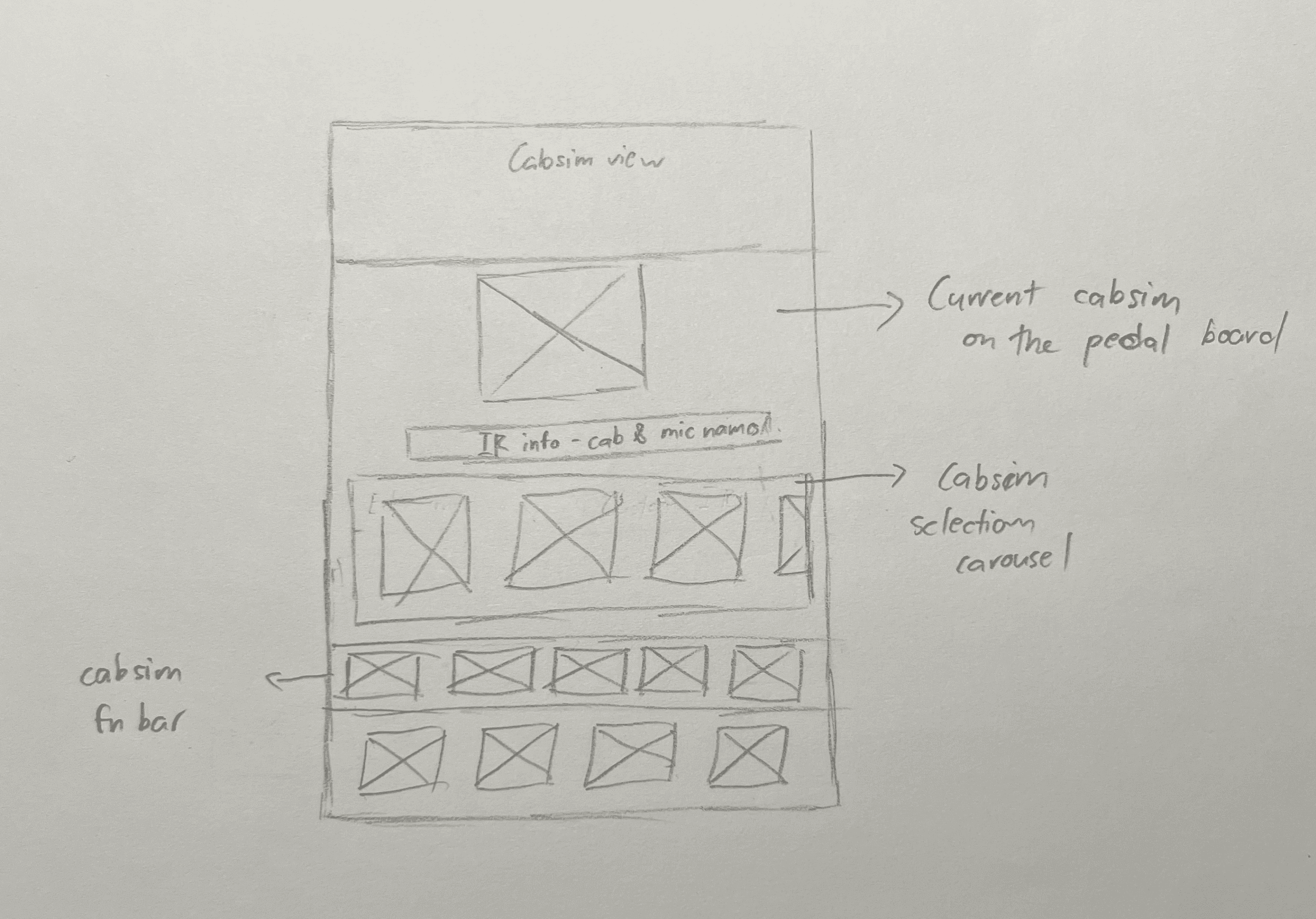
Cabinet selection wireframe
The Cabsim Redesign
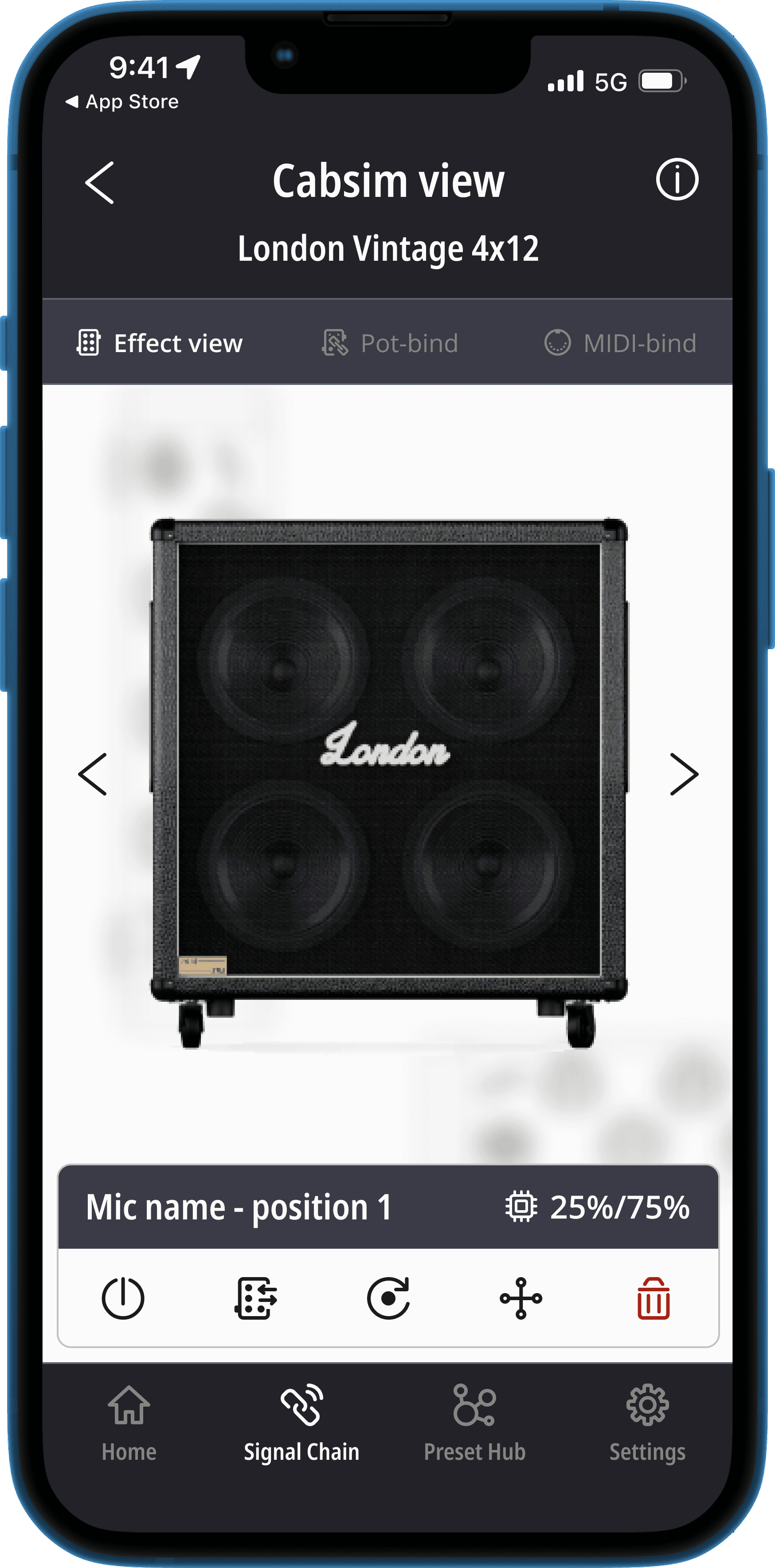
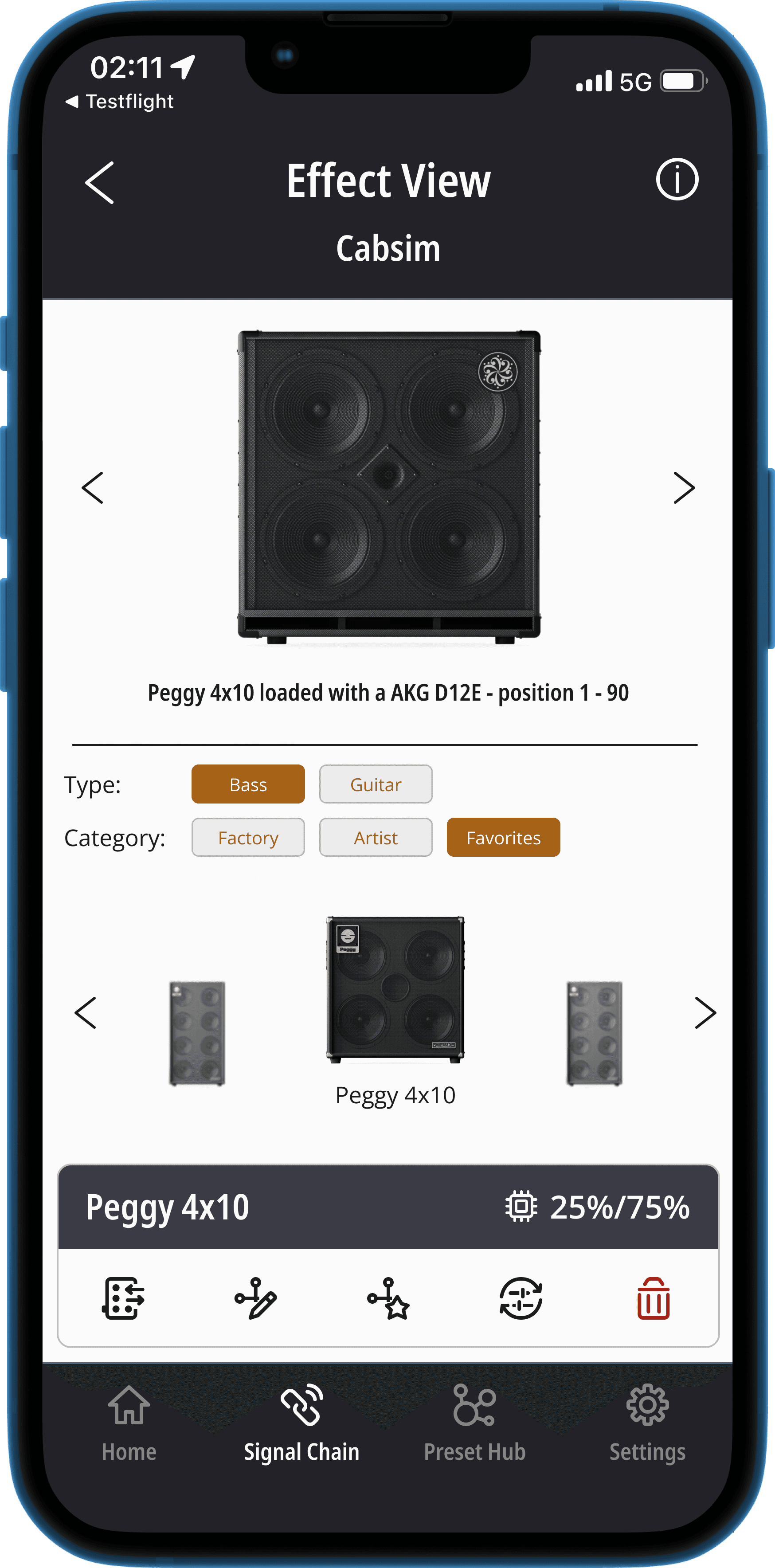
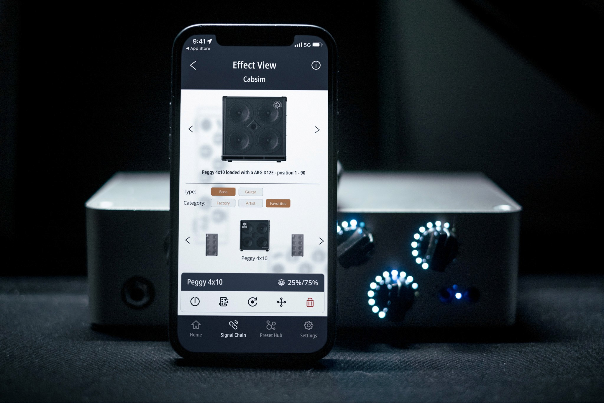
To help users switch between cabinets more easily, I added a carousel to the cabinet selection screen. This lets users quickly scroll through and pick from available cabsims, which are now organized by tags like “Artist” or “Factory” and sorted into “Guitar” or “Bass” categories. This change made it much faster and simpler to find and audition different cabinets.
The active cabinet simulation is now displayed clearly at the top of the Effects Pedal Board, showing details like the cabinet’s name, the selected microphone, and its position. Users can just tap on the active cabsim to tweak their mic settings, making the IR configuration process smoother and more straightforward.
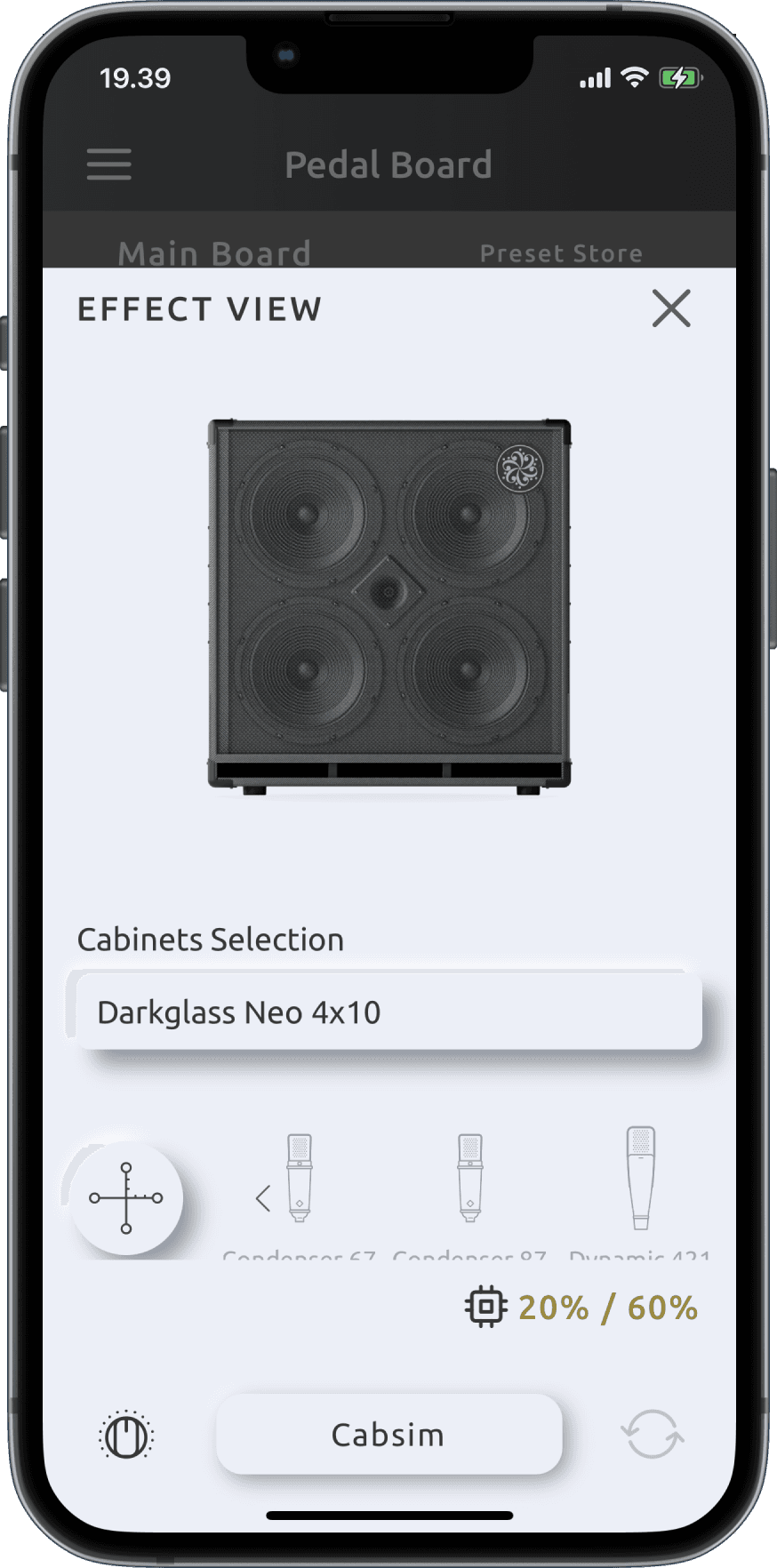
Effect View before
Cabsim View 1st iteration
Cabsim View final redesign
The Reiteration Result
The final redesign of the Cabsim View solved the issues we discovered during testing, leading to a much more user-friendly interface. Now, users can easily switch between cabinets and set up their preferences, making the IR selection and sound audition processes smoother and more enjoyable.
Beta testing
What we wanted to achieve
The main goal of our beta testing was to get real, honest feedback from Exponent 500 owners. We wanted to see how intuitive the redesigned DG Suite - Exponent 500 felt, especially for new users, and to find out how quickly they could get comfortable with the amplifier.
Beta testers group
We put together a group of 15 participants for this testing phase, which lasted two weeks. Everyone received a beta version of the app (available on iOS and Android) to put through its paces.
Who Was Involved:
In-Person Testers:
One participant who was brand new to digital amplifiers.
One experienced power user who uses the Exponent 500 regularly for live shows.
Remote Testers:
13 Exponent 500 owners, with a mix of semi-casual users and power users, who joined through a post in the Darkglass User's Facebook group.
What We Learned from In-Person Testing:
Beginner’s Experience
The beginner tester, with no prior experience with digital amps, managed to navigate most features pretty smoothly but found the effect binding a bit tricky.
He suggested an in-app guide to help new users get the most out of the Exponent 500, especially given how advanced it is.
Power User’s Take
The power user, who knows the Exponent 500 inside and out, loved the Pedal Board layout, saying it gave a clear overview of his sound setup.
He also appreciated the Function Bar for always having the right options at hand.
Overall, he found the redesign made the app more user-friendly, but he did suggest a few tweaks to improve the Preset Hub.
What They Said
Our remote testers gave us some great feedback!
They loved the new, more prominent quick-save channel UI and found the updates to the Preset Hub super valuable.
Across the board, they felt the redesign made the DG Suite much easier to use.
The Big Takeaway
The beta testing phase showed us that we were on the right track with the redesign. Both in-person and remote testers confirmed that the new DG Suite is more intuitive, accessible, and just plain easier to use. We’ll be using their suggestions, like adding an in-app guide and refining the Preset Hub, to keep making things even better.
Outcomes, and learnings
Outcomes
Official Release
After gathering valuable feedback from our beta testers, we decided that some of the suggestions could be developed into future UX projects. However, the redesigned DG Suite - Exponent 500 was deemed ready for its official release.
Final Design Screens
As part of this project, I took the initiative to create a comprehensive DG Design System and led the DG Suite Design Overhaul. This resulted in a more cohesive, user-friendly interface that aligns with Darkglass’s brand identity.
Result in Numbers
The redesigned DG Suite quickly made an impact:
The number of sound presets created for the Exponent 500 grew by 20%, increasing from around 2,000 to over 2,500 within six months.
User-generated Impulse Responses across all devices soared by 75%, going from 7,000 to over 13,000.
Feedbacks
The redesign was well-received across the board. Users shared positive feedback both online and at showcase events, praising the improvements. Exponent 500 owners, in particular, appreciated the enhanced user experience.
Examples of the positive comments from users
The Customer Support team also noticed a difference, reporting that the new IR selection process is much more intuitive and consistent, leading to fewer user inquiries.
Learnings
While the redesign focused primarily on the mobile experience, some desktop users expressed dissatisfaction, highlighting the importance of maintaining balance between different platforms. It’s crucial to remember that the DG Suite complements the physical amplifiers rather than standing as a product on its own—this perspective was central to the design process.
Additionally, the DG Suite serves as a platform for various products catering to different user groups. Features like the Cloud Platform (Preset Hub) are shared across multiple products, emphasizing the need for a unified design that provides a seamless experience across the entire suite.
These insights have reinforced the importance of a multi-platform approach and the value of consistency in design. Moving forward, I’m committed to applying these learnings to create even more user-friendly and cohesive experiences in future projects.
Next steps
The DG Suite has a desktop and and a mobile app version, with the ability to connect to a few other products, hence, the next steps would be to improve the user experience of the desktop verison of the DG Suite - Exponent 500, and to look into other products.Per suggestions from online communities, and beta testers, one of the next steps would be to implement an in-app FAQ, or tool-tip guidance, as the Exponent 500 was deemed too "futuristics" and "advanced" for the current bass players around the globe.
Based on feedback from online communities and our beta testers, one priority will be to implement in-app FAQs or tool-tip guidance. Given that the Exponent 500 has been described as “futuristic” and “advanced,” these features will help users navigate its capabilities more easily, ensuring that bass players of all skill levels can fully embrace the technology.


