Redefining Consistency: The DG Suite UI Revamp
Streamlining the user experience to create a cohesive and intuitive interface across Darkglass Electronics’ digital platform
Executive Summary
As the sole UX/UI designer, I led the comprehensive redesign of the DG Suite for Darkglass Electronics. The project aimed to resolve inconsistencies and enhance usability, resulting in a unified, user-friendly interface. By applying User-Centered Design (UCD) and Atomic Design methodologies, I developed a scalable design system that not only improved visual consistency but also significantly enhanced the overall user experience, benefiting both novice and expert users.
Highlights
‘It's f**king beautiful.’
‘User feedback praised the new interface for its intuitive design and visual coherence.’
‘Finally a Dark Mode, it helps a lot when doing a gig in a bar.’
Role
Sole UX & UI Designer
Framework
User-Centered Design
Atomic Design Methodology
Tools Used
Figma | FigJam | Whiteboard | Pen & Paper | Confluence | TestFlight
Platforms
Android | iOS | Windows | MacOS
Context and Background
Overview
The DG Suite was designed to be a powerful digital platform for managing Darkglass Electronics’ amps and pedals. However, as the product line expanded, the interface became increasingly inconsistent and difficult to navigate. Users—from beginners to pros—began to experience frustration as they tried to interact with the suite, which no longer reflected the seamless experience Darkglass is known for.
With a growing need to align the DG Suite with the brand’s high standards, it was clear that a redesign was essential. The goal was to create a cohesive, intuitive interface that would be easy to use, scalable, and visually consistent across all devices.
Problem
Inconsistent Design: The suite’s interface had become fragmented, with different sections using varied design styles, leading to a confusing user experience.
User Frustration: Many users, especially those new to the platform, found it hard to navigate and perform key tasks like device configuration and preset management.
Scalability Issues: Without a unified design system, adding new features was slow and often resulted in even more inconsistencies.
Outdated Visuals: Some design elements were outdated, which didn’t align with Darkglass’s image as an innovative, cutting-edge brand.
Need for Change: Continuous feedback highlighted the urgent need for a redesign that would simplify the experience and meet the needs of all users.
The team
Me as a UX & UI designer
1 industrial designer
2 software developers
Challenge
A total revamp of the user interface could irritate users, given they've grown comfortable with the Suite's functionality. Nonetheless, this UI overhaul provides chances to rectify ongoing usability issues.
Detective work
Visual audit
Audit Process
As a designer, I believe in starting with a solid understanding of both the users and the products before diving into the visual design phase. To ensure a smooth and consistent experience across the DG Suite, I took a deep dive into each Darkglass device that connects to the Suite. This was essential for grasping their capabilities and how users interact with them. The categories were: Amplifiers, Pedals, Combo, and Accessory.
Amplifiers
Pedals
Combo
Accessory
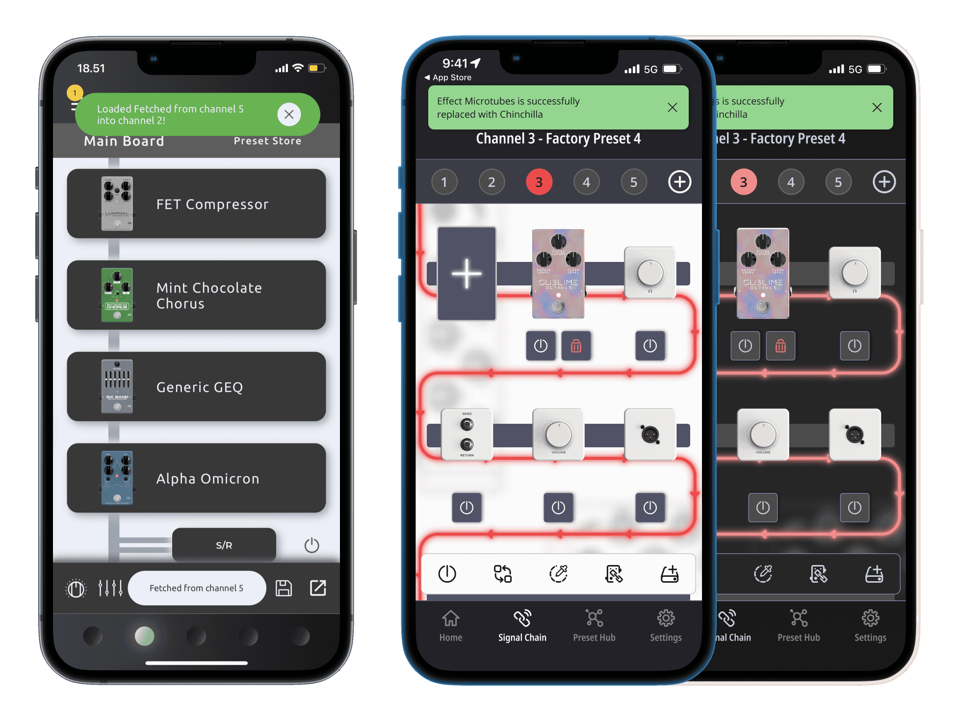
With the accessory (Darkglass MIDI footswitch) and combo (Microtubes Infinity Combo) still in development, the redesign needed to anticipate and integrate their unique features. Most devices, like pedals and amplifiers, shared common functionalities, but the Exponent 500 stood out with its special Pedal Board feature, which needed extra attention due to its complexity and unique user interactions.
Visual Audit Findings
During the visual audit, I uncovered several key issues that were impacting the user experience across the DG Suite:
Hidden Functionalities: Many important features were hidden behind gestures such as long holds and left swipes, which were not clearly indicated to users. This lack of discoverability led to confusion and frustration, as users often didn’t realize these functions existed or how to access them.
Inconsistent Visual Hierarchy: The visual hierarchy was off on many screens, making it difficult for users to quickly identify the most important actions or information. In some cases, key functions were buried under less important elements, leading to a cluttered and overwhelming interface.
Common Features: The Impulse Response (IR) feature and a Cloud Platform for uploading and exploring sound presets were consistent across all devices.
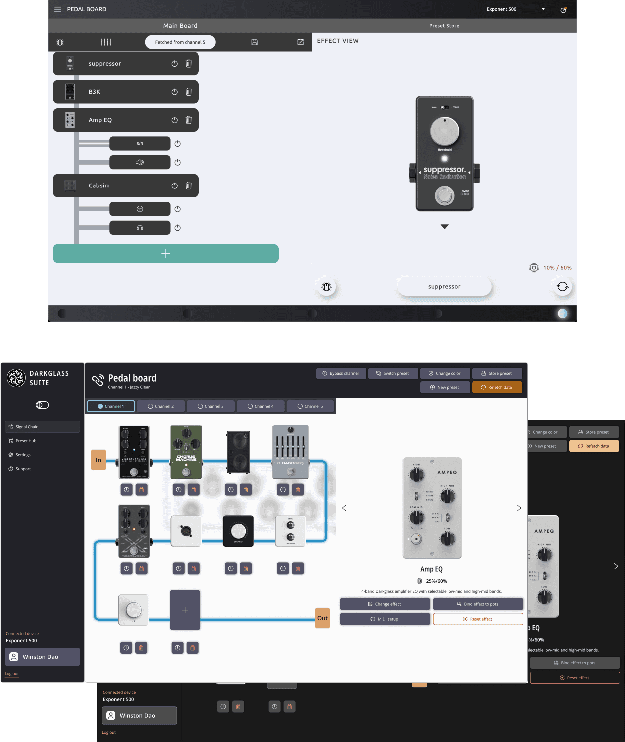
Unique Features: The Exponent 500’s Pedal Board, which lets it function as a multi-effects pedal, required a custom design, especially for quick-save channel operations.
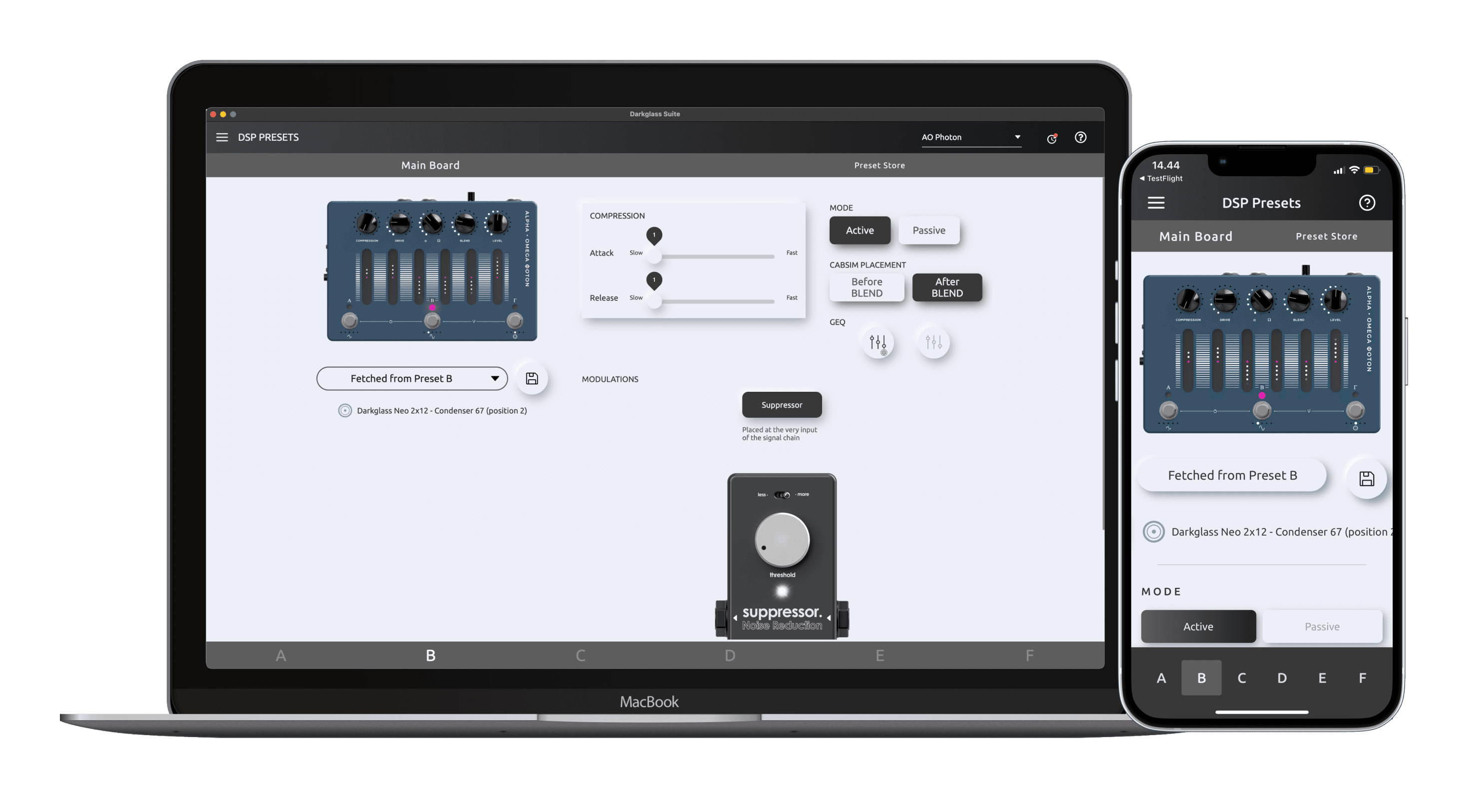
Pedals and other amplifiers' common DSP preset screen
Exponent 500 unique feature - the Pedal Board
These issues not only created a steep learning curve for new users but also caused frequent errors and frustrations among experienced users. These insights drove specific design changes, such as introducing clear visual cues for hidden gestures and reorganizing the visual hierarchy on key screens to prioritize essential functions, ensuring a more intuitive and user-friendly interface.
User research
Customer Support Insight
Once I had a good handle on the features and functionalities of the DG Suite, I turned my attention to how users were actually interacting with them. I gathered insights from customer support, which revealed that user experience issues varied depending on the device.
Key Issues Identified
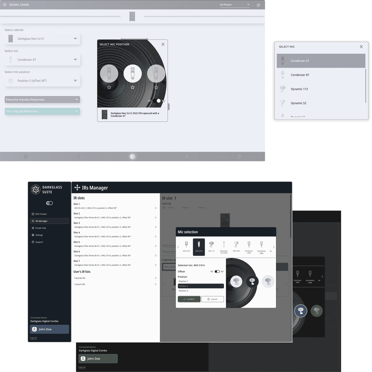
Impulse Response (IR) Workflow: Users often found the IR feature tricky to use, especially on the Exponent 500, where its complexity called for a more thoughtful design.
Exponent 500 Complexity: The Exponent 500, with its multi-effects pedal functionality, presented unique challenges that weren’t as prominent in simpler devices, making it clear that a focused redesign was needed.
Online Communities and Threads
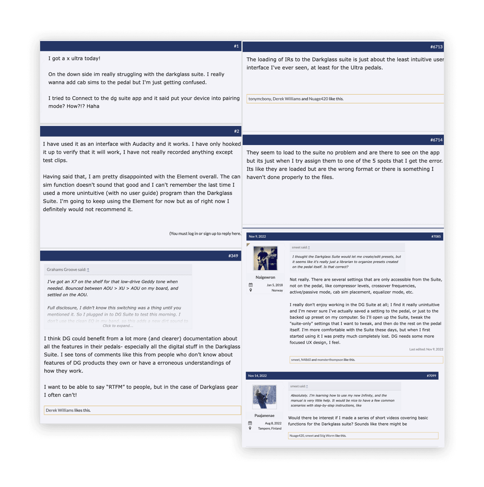
I explored user feedback on platforms such as TalkBass, the Darkglass User’s Facebook group, and Reddit. These discussions provided valuable insights into common frustrations and areas where users felt improvements were needed.
Some of the users' complaints regarding the general usage of the DG Suite
Recurring Complaints
User Interface: The IR feature and sound preset management were frequently mentioned as difficult to navigate and not very intuitive.
Lack of Documentation: Users often struggled due to the lack of detailed instructions in the user manual, leading to frequent questions to customer support.
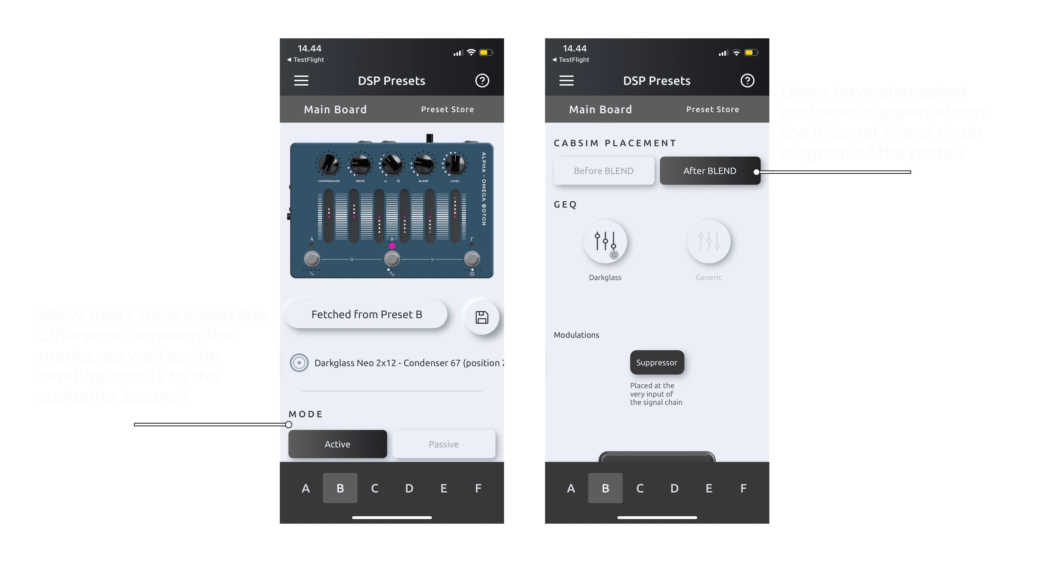
One of the repetitive inquiries found on online threads and communities.
User research findings
From my research, a few key points stood out
Widespread Dissatisfaction: Many users were unhappy with the DG Suite’s user experience, especially when it came to loading IRs.
Complexity of the Exponent 500: The Exponent 500’s advanced features make it a powerful tool, but it also means it needs a more user-friendly design to match.
Information Gaps: Pedals and amplifiers didn’t provide enough in-app guidance on settings, particularly on the DSP preset screen, leaving users confused.
Outdated UI: There were frequent complaints about the overall user interface, with users describing it as outdated and inconsistent, leading to frustration when trying to navigate or complete tasks.
Design Process and Ideation
Design Principles and Goals
After gathering insights from my exploration, it was clear that the DG Suite needed a thoughtful redesign to address the key challenges users were facing across various devices. The main goals for the redesign were:
Improve Discoverability: Ensuring that essential features across amplifiers, pedals, and combos are easily accessible and intuitive to use.
Streamline Workflows: Simplifying complex interactions to enhance user efficiency and reduce frustration, particularly for devices with intricate settings.
Ensure Visual Consistency: Creating a unified and modern visual language that is consistent across all devices, reinforcing Darkglass’s brand identity.
Ideation and Concept Development
With a clear vision in place, I began brainstorming design solutions that would work across all devices in the DG Suite. I explored different ideas through sketches and wireframes, always keeping the user’s experience at the forefront
Sketching and Wireframing: Early sketches helped me visualize different design directions, particularly for making hidden features more discoverable and improving the visual hierarchy across key screens. Wireframes provided a more detailed exploration of user flows and interactions, focusing on simplifying complex tasks like navigating presets and loading IRs.
User Flows and Interaction Design: I reimagined the user flows to make them as intuitive as possible. This included reducing the reliance on hidden gestures, ensuring that important actions were easy to find and use across all devices.
With these goals in mind, I focused on design principles like simplicity, clarity, and user empowerment. These principles guided every decision in the redesign process, ensuring that the final product would not only meet user needs but also enhance their overall experience with the DG Suite.
Design System Integration
To further enhance consistency and streamline the development process, I also led the creation of the DG Design System. This system served as the backbone for the DG Suite redesign, providing a unified set of guidelines and reusable components.
Consistency Across the Suite: The design system served as the foundation for all UI elements, ensuring that every device within the DG Suite felt cohesive and unified. This consistency was crucial for creating a seamless experience across different products and platforms.
Building a Scalable System: By creating a flexible and scalable design system, we ensured that the DG Suite could easily adapt to future needs, including the introduction of new devices and features.
For an in-depth exploration of how the DG Design System was developed and implemented, and how it supported the redesign of the DG Suite, you can view the full project here: DG Design System: Building Consistency Across Darkglass Products.
Related Work on the Exponent 500
While the DG Suite redesign focused on improving the user experience across a range of Darkglass devices, the Exponent 500—a key product with its unique Pedal Board functionality—required a deep dive of its own. The redesign work for the Exponent 500 addressed specific challenges related to its advanced features and user interactions.
For a detailed look at how the Exponent 500 was reimagined, including the redesign of its Pedal Board and other unique functionalities, please check out the dedicated project: Elevating the Bassist's Experience: The Exponent 500 UX Transformation.
Testing through collaboration
Instead of building separate prototypes, I worked closely with our developers to create test versions of the DG Suite using TestFlight. This approach proved to be more effective, especially since the DG Suite requires integration with physical devices for full functionality. By testing directly on devices, we could better evaluate the design in its intended context.
TestFlight Iterations: By using TestFlight, we were able to deploy different test versions of the DG Suite quickly, allowing us to gather feedback in real-time. This method was particularly useful for testing how well the design integrated with the Exponent 500 and other Darkglass devices, ensuring that the final product worked seamlessly in practice.
Real-World Testing: Testing the Suite in real-world conditions, with actual connections to physical devices, provided invaluable insights that wouldn’t have been possible with traditional prototypes. This process allowed us to identify and resolve issues more effectively, ensuring that the design met the needs of our users.
With these goals in mind, I focused on design principles like simplicity, clarity, and user empowerment. These principles guided every decision in the redesign process, ensuring that the final product would not only meet user needs but also enhance their overall experience with the DG Suite.
Cross-Platform Design
Designing for Both Desktop and Mobile
A key challenge in the DG Suite redesign was ensuring that the user experience was seamless across both desktop and mobile platforms. Each platform comes with its own set of user expectations, constraints, and opportunities, so it was essential to tailor the design to meet these unique needs while maintaining a consistent brand and functional experience.
Desktop Version
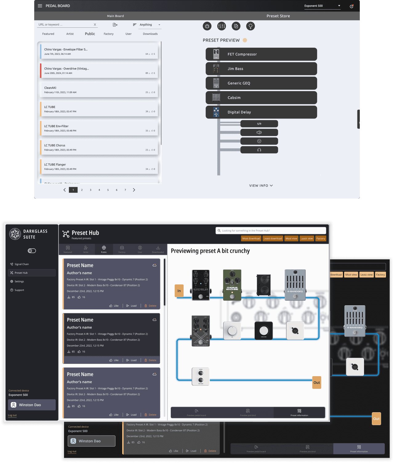
Layout Optimization: The desktop version was designed to leverage the larger screen space, making complex tasks more intuitive and accessible. This included creating layouts that allowed users to easily manage multiple features simultaneously, with clear pathways for navigation and a strong visual hierarchy that emphasized key actions.
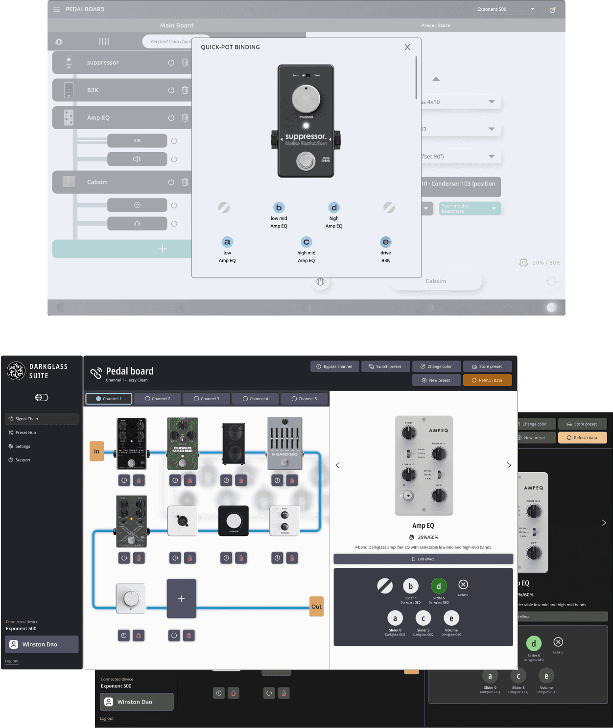
Shared desktop layout of all Darkglass devices
Feature Access: Desktop users often engage in more detailed and complex workflows, so the design incorporated advanced features with shortcuts and hotkeys to enhance productivity. The interface was designed to facilitate quick access to these features, reducing the number of clicks needed to perform key tasks.
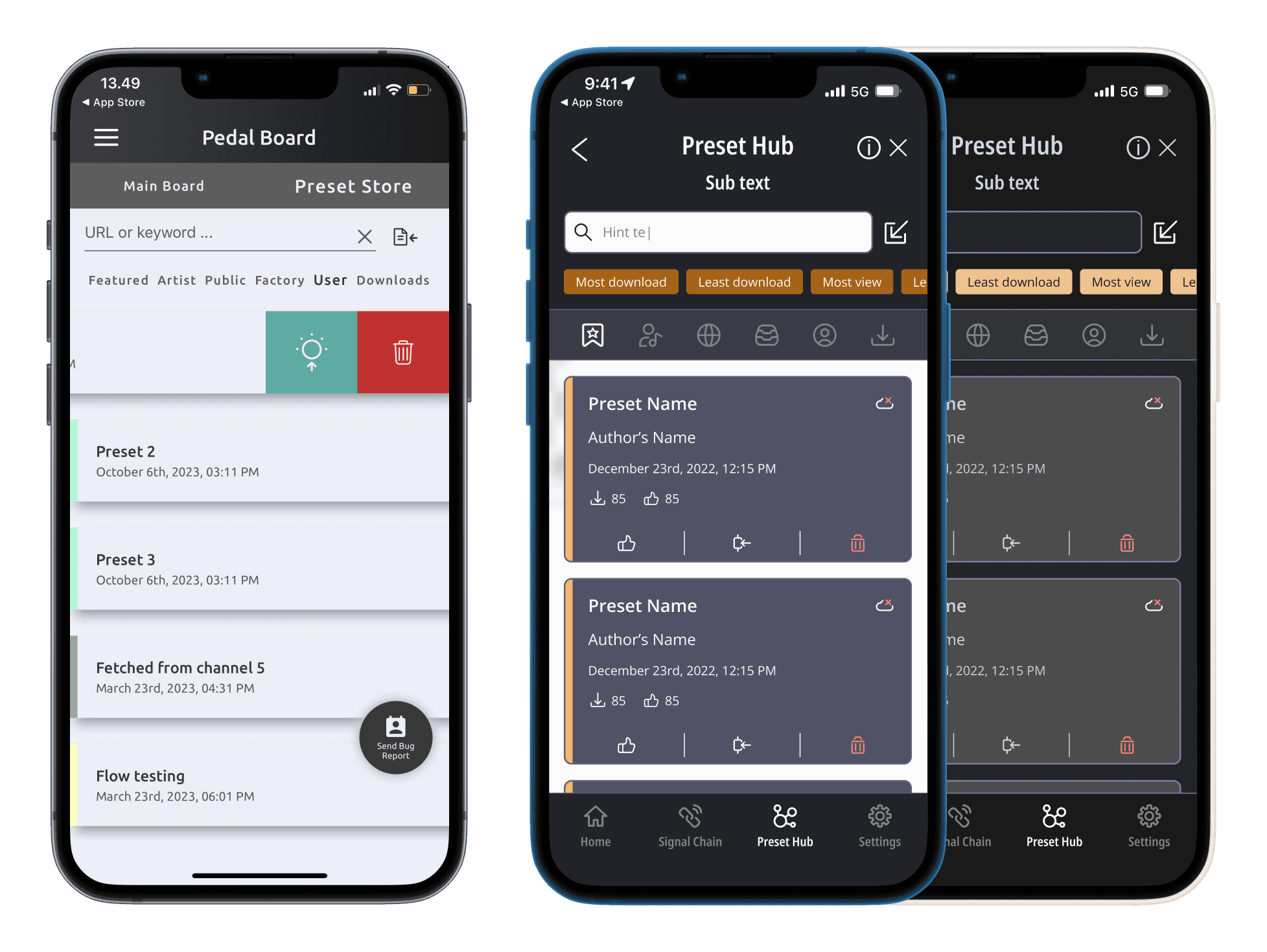
Preset Hub & Preview Before & After
Mobile Version
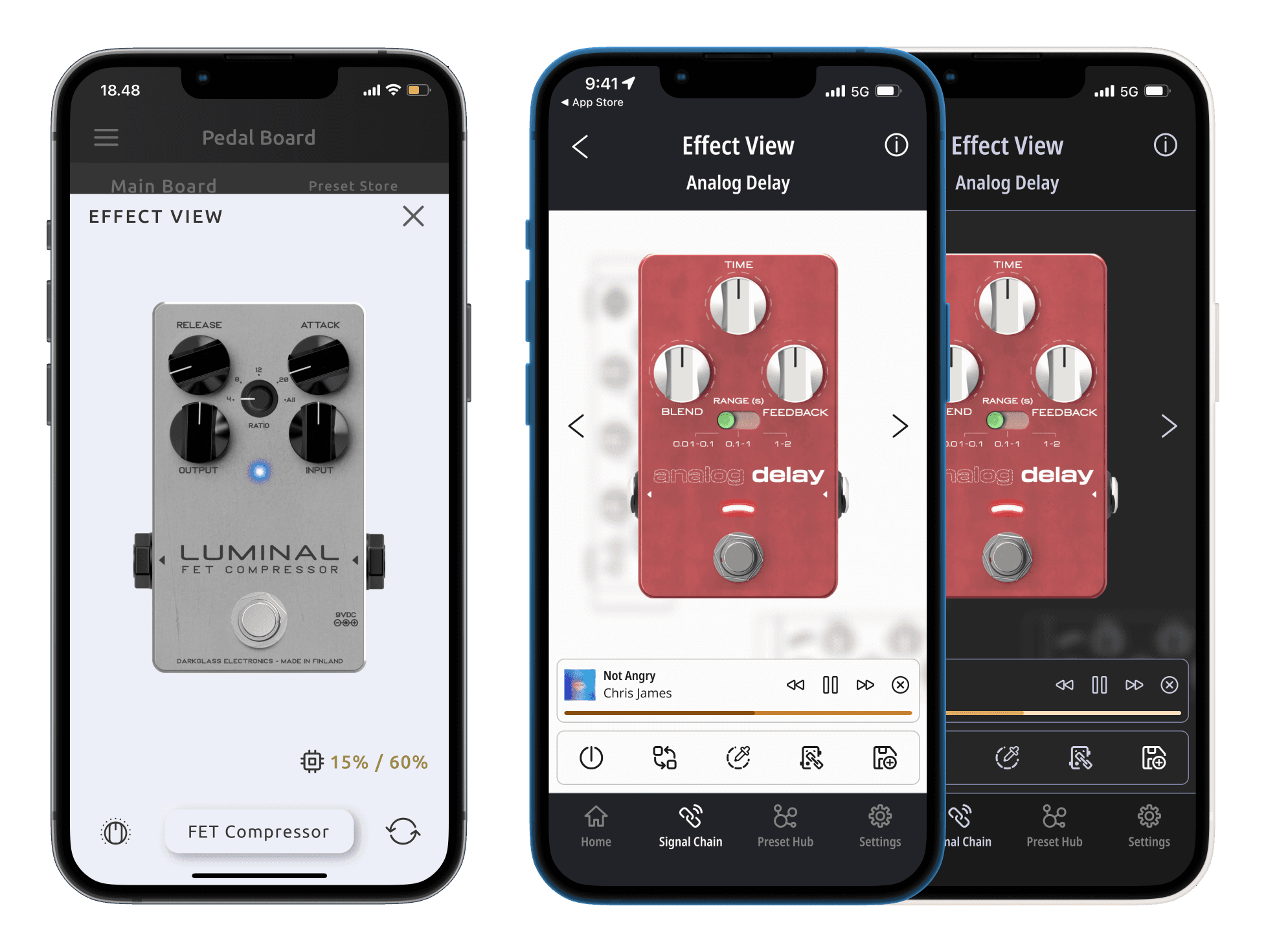
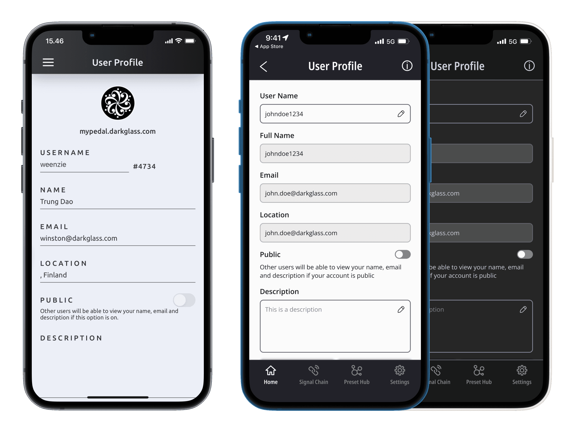
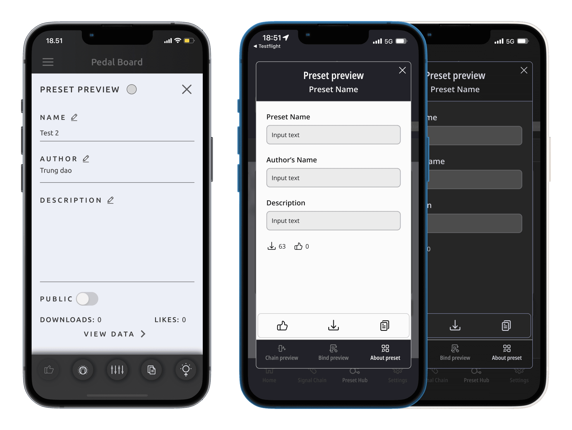
Streamlined Interface: The mobile design focused on simplicity and ease of use, ensuring that key features were readily accessible with minimal interactions. Given the smaller screen size, it was crucial to prioritize thumb-friendly design and reduce the steps required to perform essential tasks. The interface was streamlined to ensure that users could achieve their goals quickly, without unnecessary complexity.


DSP screen for all pedals & amplifiers
Consistency Across Devices: While the mobile version was simplified, I ensured that the visual style, branding, and interaction patterns remained consistent with the desktop version. This allowed users to switch between platforms seamlessly, without needing to relearn the interface.
Combo DSP main screens
Ensuring a Seamless User Experience
By designing the DG Suite with both desktop and mobile users in mind, I ensured that the application provided a cohesive and intuitive experience across all platforms. This cross-platform design approach was essential for meeting the diverse needs of Darkglass users, whether they were working in their studio or on the go. The result was a unified experience that allowed users to interact with the DG Suite confidently, regardless of the device they were using.
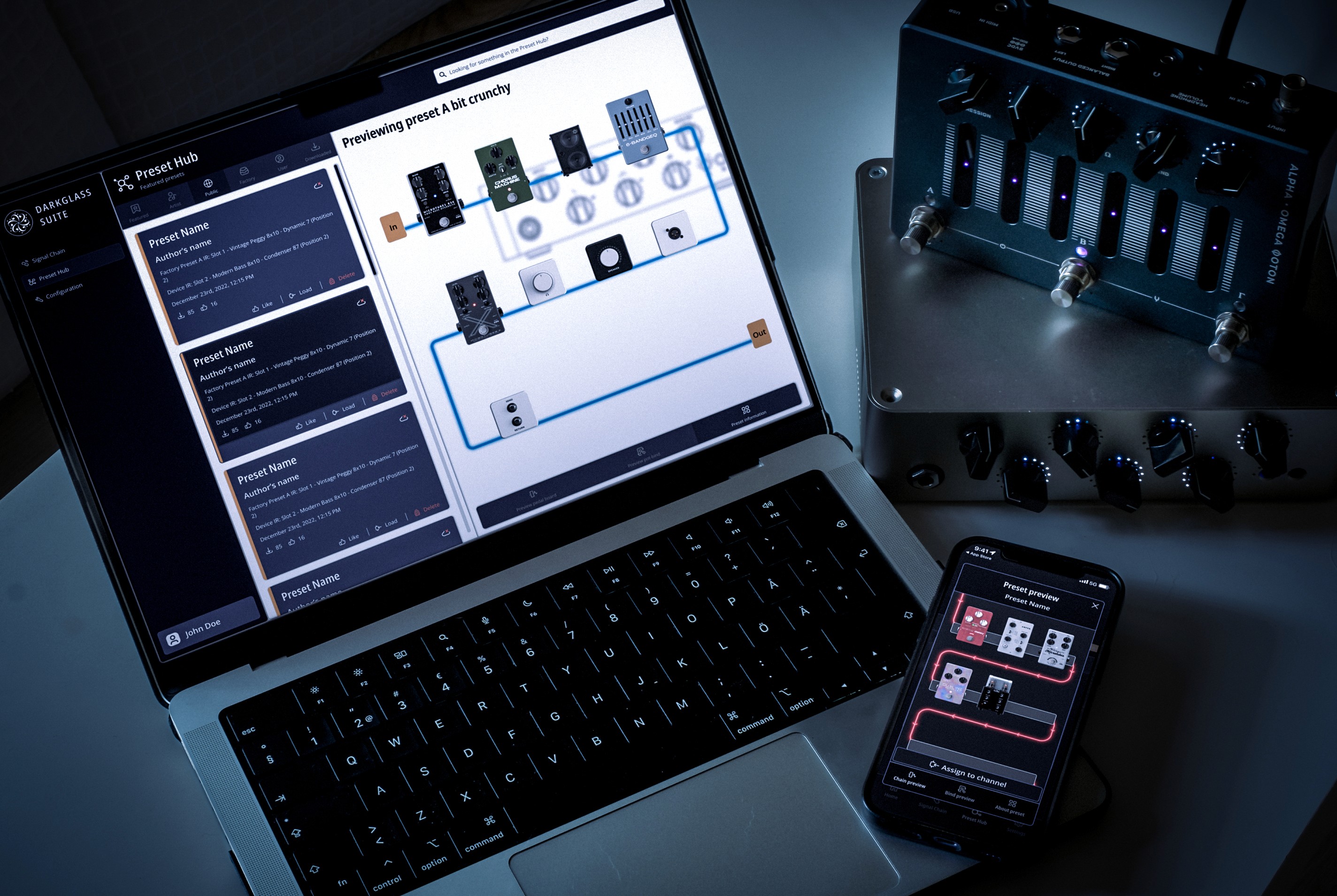
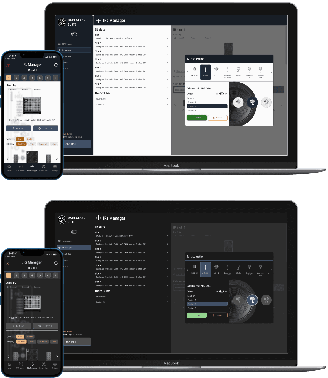
DG Suite Mobile - Before and after design overhaul with Darkmode
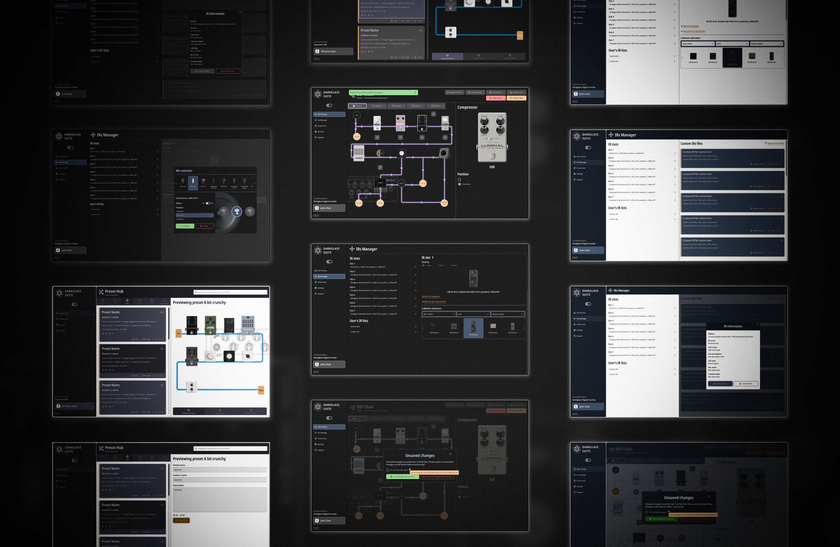
DG Suite Desktop - Before and after design overhaul with Darkmode
