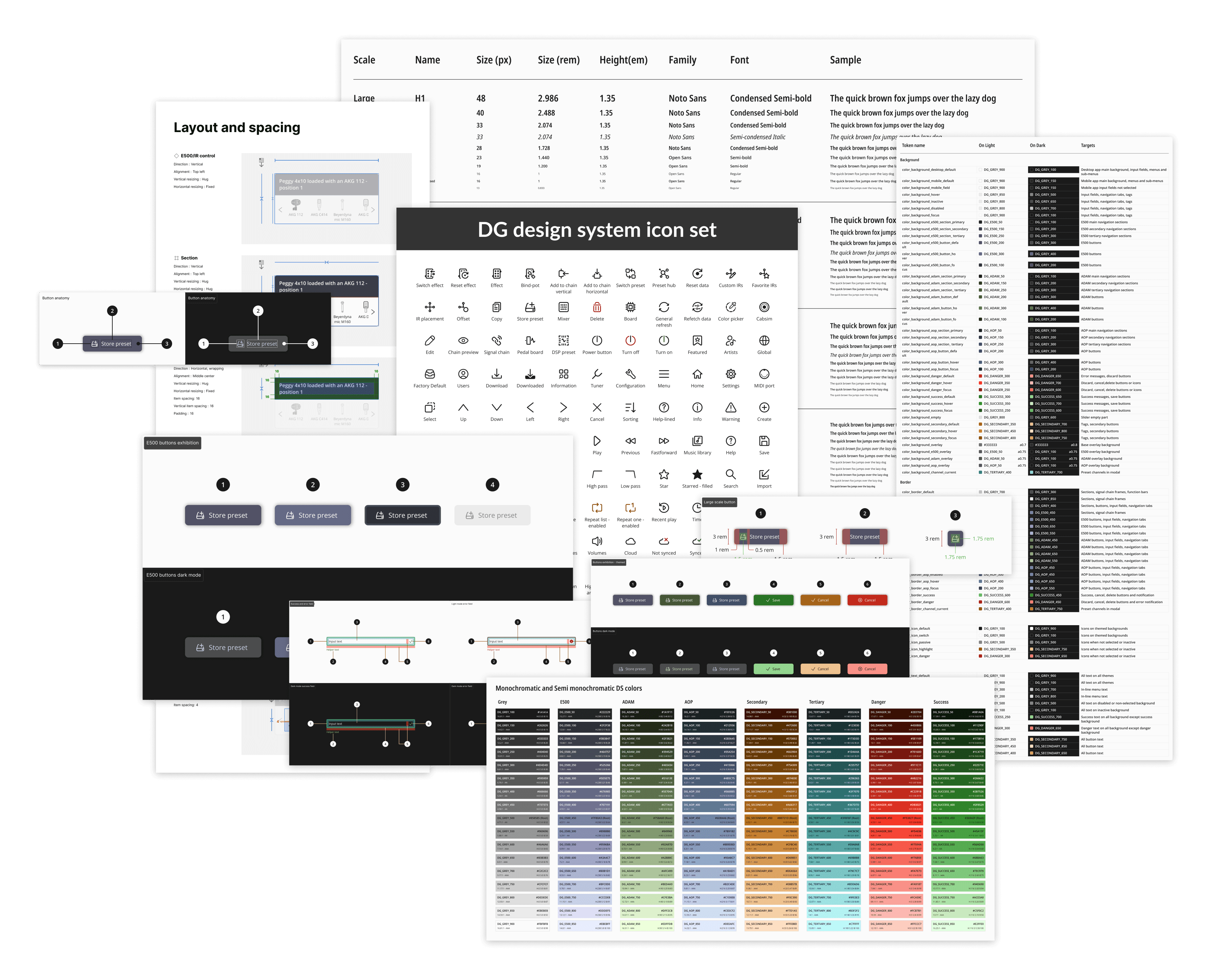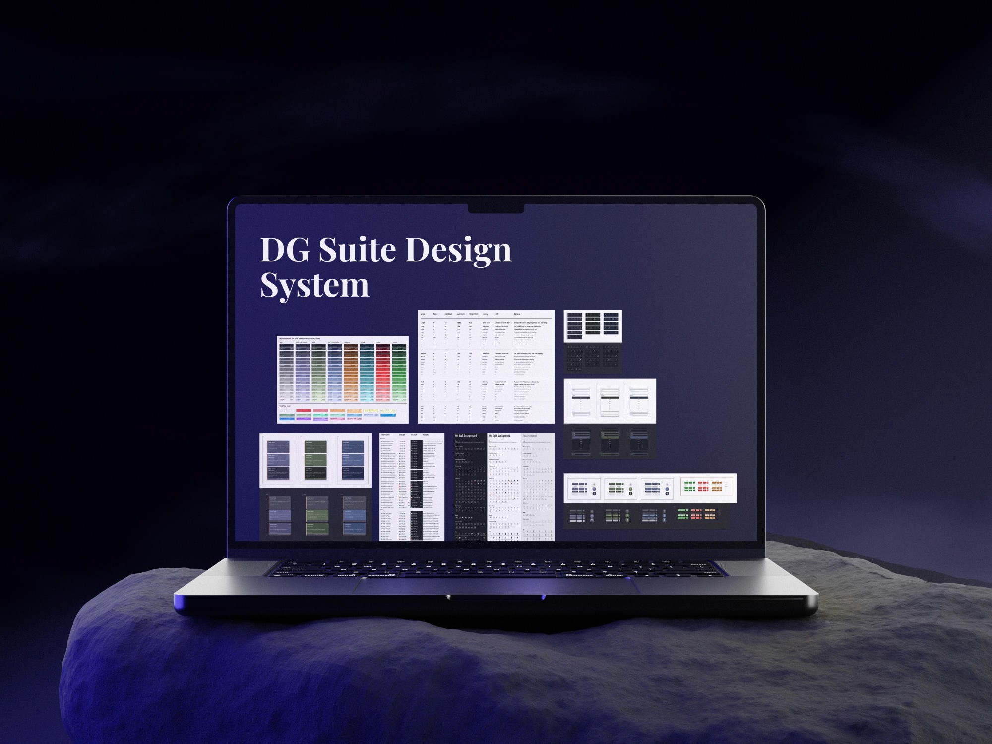
Crafting Consistency: The DG Design System
Executive Summary
As the sole UX/UI designer at Darkglass Electronics, I spearheaded the development of the DG Design System to address inconsistencies and streamline the design process across the DG Suite. By adopting the Atomic Design Methodology, I created a comprehensive, reusable component library that ensures a cohesive user experience across mobile and desktop platforms. This design system not only improved visual consistency but also significantly accelerated development timelines.
Highlights
The DG Design System enabled faster development cycles, with a consistent look and feel across all products.
The design system reduced the time developers spent on UI creation by providing clear, reusable components.
Role
Sole UX & UI Designer
Framework
Atomic Design Methodology
Platforms
Android | iOS | Windows | MacOS
Tools Used
Figma | Jira | Confluence | TestFlight
Context and Background
About
The Darkglass Suite
Before I joined the Darkglass Electronics, there had never been a Product Designer involved in the creation of the DG Suite. As a result, the suite lacked a cohesive style guide, UI library, templates, and design patterns. Each product within the suite had its own design approach, leading to inconsistencies and inefficiencies across the platform.
My Role
As the sole UX/UI designer at Darkglass, I led the initiative to develop a comprehensive design framework. Collaborating closely with our software engineers, my mission was to establish a single source of truth for design elements, streamlining both the design and development processes.
Why we needed a design system
The challenges
Lack of Consistency: Each product’s visual and interaction elements varied, leading to a fragmented user experience.
Inefficiencies: Without reusable templates or patterns, creating new features was time-consuming, and developers often had to take on design tasks, slowing down the overall development process.
Design Debt: Over time, inconsistencies and ad-hoc design decisions accumulated, making future updates and maintenance increasingly complex.
Collaboration Challenges: With no standardized design framework, collaboration between designers, developers, and other stakeholders was often challenging, leading to miscommunication and rework.
Scaling Difficulties: As the suite expanded, the lack of a unified design approach made it difficult to scale efficiently.
Adaptability: The absence of a structured system made it challenging to implement features like dark and light themes effectively.
Opportunities
In Summary
The goal
The primary goal was to establish a simple yet robust DG design framework with integrated design tokens. This foundation would pave the way for creating a comprehensive UI kit, enabling faster and more consistent feature development.
The Process
Building a robust Design System from the ground up required a thoughtful and structured approach. To achieve this, I adopted the Atomic Design Methodology, breaking down the User Interface into essential building blocks.
My first priority was to establish a solid style guide that would serve as the foundation for the entire DG Suite, ensuring consistency, scalability, and a polished user experience.
After the style guide was created, I created the UI Library that contains all reusable components, patterns and templates for both the mobile and desktop version of the DG Suite.
Laying the Foundation
Typography
Clear and Modern Identity Typefaces
For the DG Suite, I selected Noto Sans Condensed and Open Sans to create a clean, modern, and cohesive visual identity. This pairing balances visual harmony, readability, and space efficiency, ensuring a consistent and accessible experience across all devices.
Chosen typefaces for the DG Suite
Establishing a Scalable and Flexible System
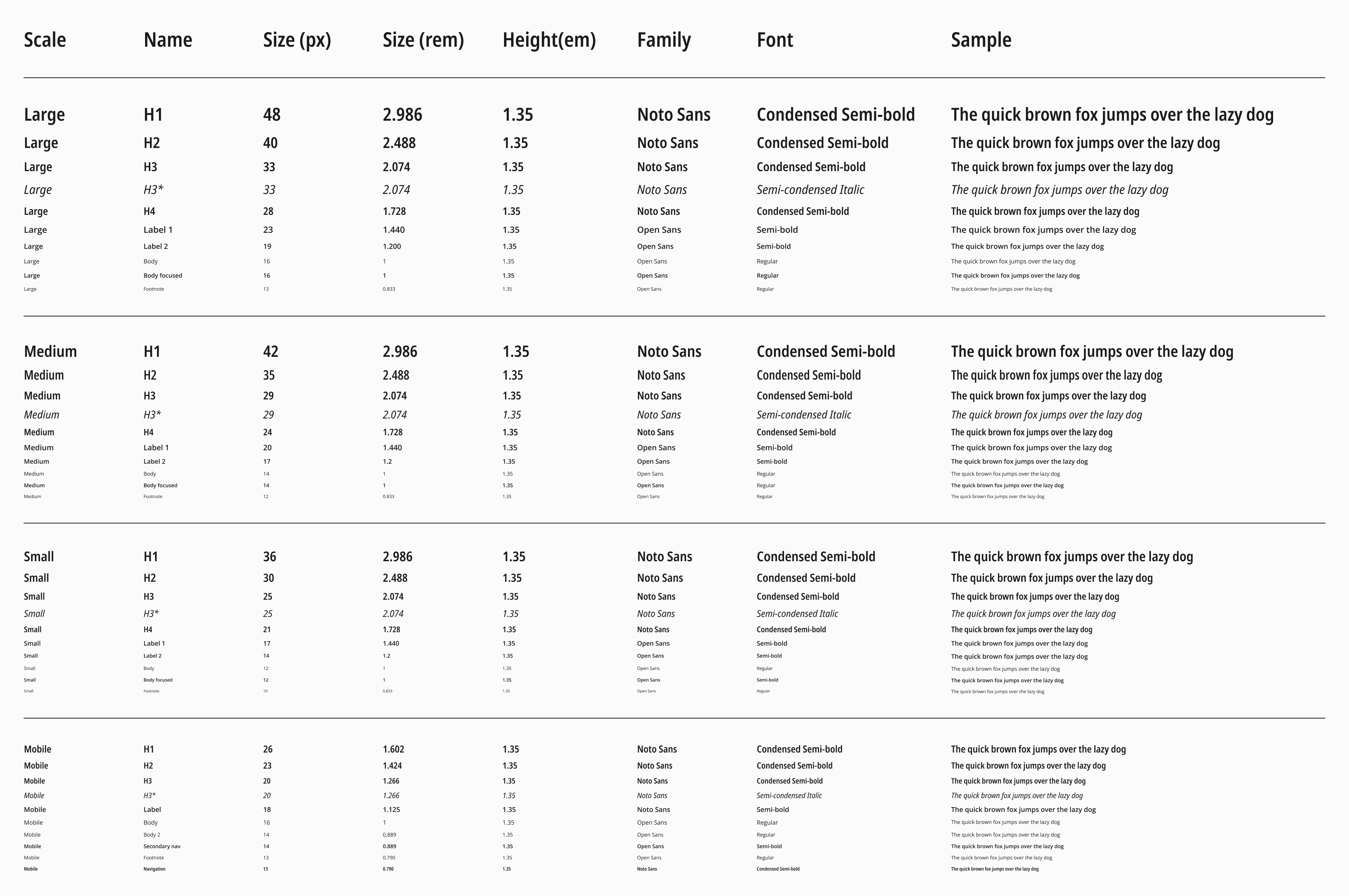
To ensure a consistent and readable typographic hierarchy across the DG Suite, I implemented type scales tailored to each platform:
Desktop: Minor Third (1.200) Type Scale
Balanced Visual Hierarchy: The Minor Third scale creates a harmonious balance between text sizes, making it ideal for desktop screens where users need clear distinctions between headings, subheadings, and body text.
Flexibility: This scale provides a versatile range of font sizes that can adapt to various content types and layouts, ensuring that the design remains cohesive and visually appealing across different pages.
Mobile: Major Second (1.125) Type Scale
Optimized Space Usage: This scale strikes a balance between readability and space efficiency, allowing for a clean, uncluttered look on mobile devices without sacrificing user experience.
Enhanced Readability: The Major Second scale offers slightly larger steps between font sizes, which is crucial for improving readability on smaller screens. It ensures that text remains legible and accessible, even in compact layouts.
DG Design System official typography
Why using Type Scales?
Consistency Across Platforms: By using defined type scales, I ensured that typography is consistent across both desktop and mobile versions of the DG Suite, providing a seamless experience for users who switch between devices.
Clear Visual Hierarchy: The type scales help establish a clear visual hierarchy, making it easy for users to navigate and absorb content. This is particularly important in complex applications like the DG Suite.
Efficiency in Design: With a structured type scale, it’s easier to maintain consistency throughout the design process. This not only speeds up design iterations but also simplifies the development process by providing clear guidelines.
Scalability: The chosen type scales are flexible and can easily adapt as the product grows, ensuring that new content or features can be integrated without disrupting the overall design.
By leveraging the Minor Third and Major Second type scales, I created a typographic system that is not only visually cohesive but also adaptable and user-friendly across all devices.
Color palette - Defining the Visual Identity
The Vision
When designing the color palette for the DG Suite, my goal was to craft a system that not only looked visually appealing but also deeply resonated with the Darkglass brand. I wanted each color to reflect the unique character of the devices while ensuring functionality and accessibility across all user interactions.
Building the Palette
Device-Inspired Hues
Primary Colors: Device-Inspired Hues:
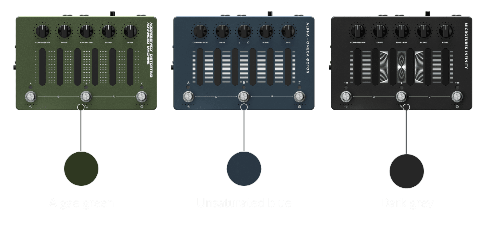
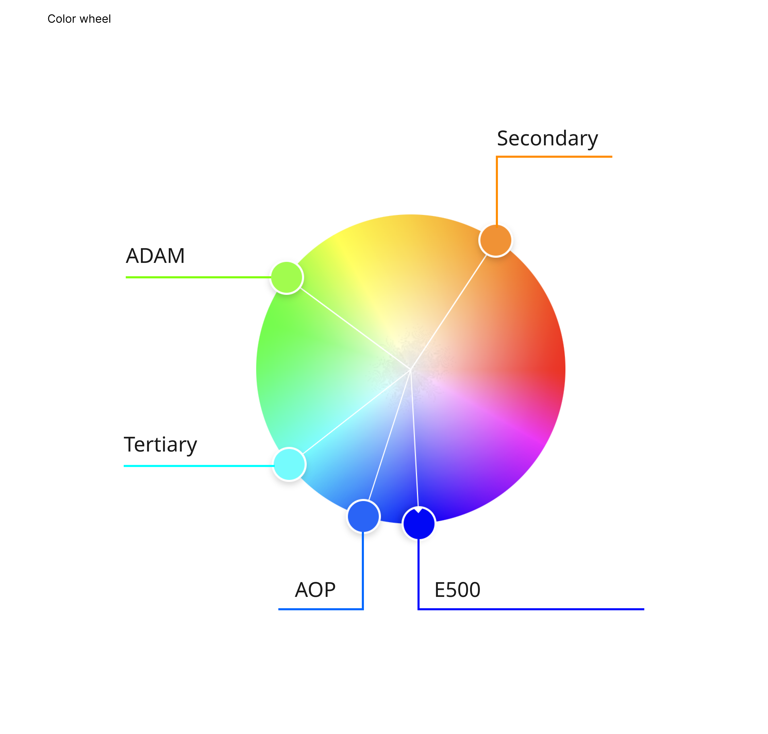
To anchor the DG Suite’s visual identity, I developed three distinct sets of primary colors, each inspired by key Darkglass devices (PMI, ADAM, AOP). These bold, distinctive colors are never used together but instead are paired with supporting and functional colors to maintain a clean, focused interface.
I opted for a deep violet hue over the dark grey of the PMI device, reserving the grey for the neutral monochromatic palette.
Supporting and Functional Colors
Supporting Colors: I introduced secondary and tertiary hues that complement the primary colors. These versatile shades enhance the design, adding depth without overpowering the interface.
Functional Colors: I selected clear, effective colors for success and danger states, ensuring that critical information is always easy to identify and act upon.
Neutral palette
A range of grays provides the foundation for the DG Suite’s design, allowing primary and supporting colors to stand out. This neutral base ensures that the overall look remains sleek and sophisticated, with a consistent visual hierarchy throughout the suite.
The Contrast Eligibility
Meeting WCAG guidelines was a top priority. To avoid harsh contrasts, I excluded pure black and white, using them strategically only in monochrome themes. I also tested all color combinations rigorously to ensure they provide sufficient contrast for users with visual impairments, making the DG Suite both accessible and visually cohesive.
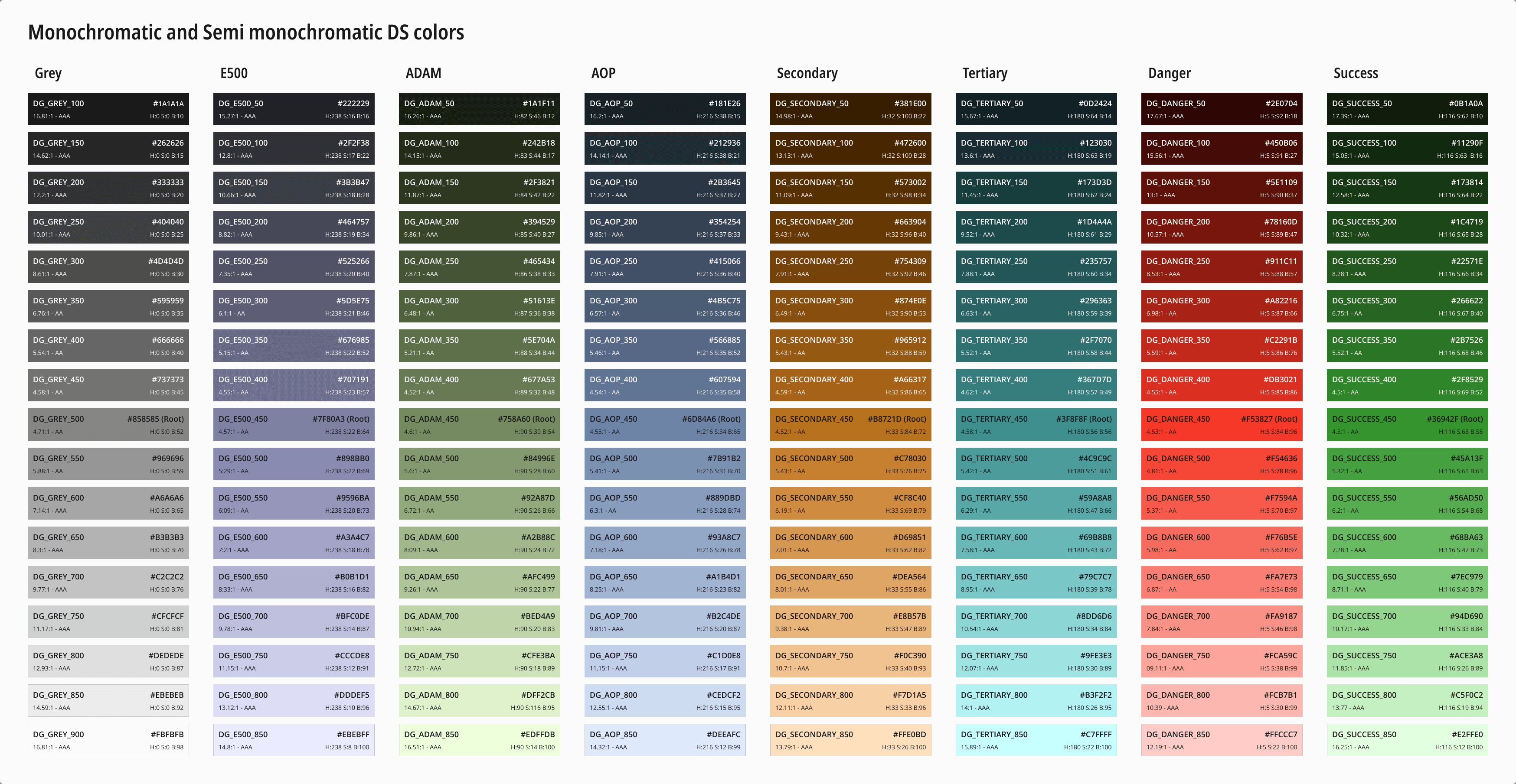
Monochromatic and Semi-monochromatic Color Ramps
The official DG Design System color palette - Click to enlarge
To ensure the interface is effective in both dark and light modes, I created monochromatic and semi-monochromatic color ramps. These ramps were carefully calculated using HSB parameters, maintaining color harmony while meeting all contrast requirements. This approach not only enhances visibility but also ensures that the interface is adaptable and user-friendly in various environments.
Iconography - Precision in Simplicity
User-Centered Design
Simplicity and clarity were at the forefront of the design process, making sure that each icon is instantly recognizable and easy to understand. This user-centered approach helps reduce cognitive load and improves overall navigation within the DG Suite.
Icon Design Principles
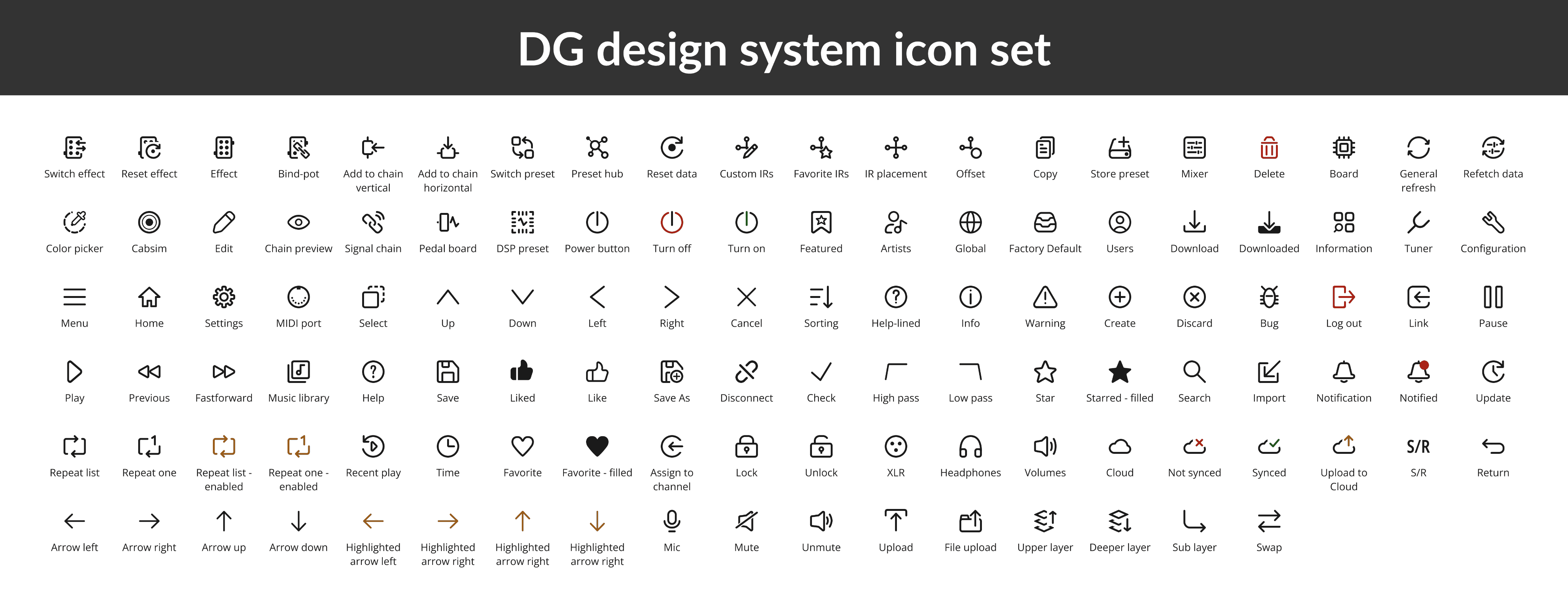
Given the unique capabilities of the DG Suite, I created a custom icon set that ensures visual consistency and enhances user experience. The guiding principles were simplicity, uniformity, and clarity—key to making the icons intuitive and easy to recognize.
The Layout
All icons were designed on a 32x32 grid with a default stroke weight of 2dp and 3dp rounded corners. This consistent framework ensures that the icons maintain a clean and cohesive look across the suite.
In certain cases, I adjusted the inner stroke weight to 1.5dp to maintain visual balance, ensuring each icon remained proportionate and harmonious.
Maintaining Simplicity
To prevent overly intricate designs, I maintained a minimum of 2dp spacing between inner lines. This negative space is crucial for keeping the icons functional and aligned with the suite’s clean, user-friendly design.
Building a Simple DG Design System
Scaling for Clarity and Readability
To ensure the DG Suite maintains visual clarity and readability across various screen sizes, I developed a tailored scaling system for both desktop and mobile interfaces.
Desktop Scaling Strategy
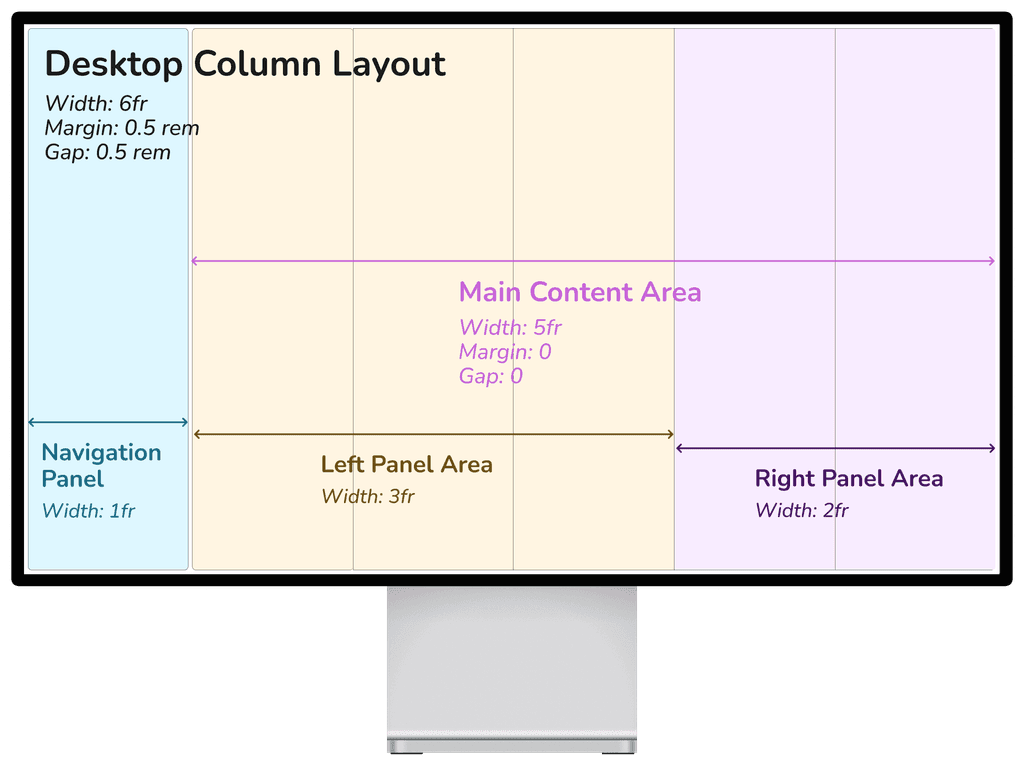
For desktop components, I used “em” and “rem” units to allow components to scale smoothly with user settings. This approach enhances accessibility and ensures a consistent look across different resolutions. For layouts, I utilized “fr” for grid columns and percentage-based units (“vw” and “vh”) for responsive adjustments, creating fluid layouts that adapt seamlessly to various screen sizes.
Desktop column layout template
Mobile Scaling Strategy
On mobile, I focused on optimizing space while preserving readability. By implementing calibrated type scales and spacing, the design remains functional and accessible on smaller screens. This approach ensures that the user experience is consistent, whether on a large monitor or a mobile device.
Challenges and Solutions
Balancing flexibility with visual consistency was a primary challenge. Using relative units and a structured scaling system, I ensured that the DG Suite adapts well to various screen sizes while preserving the design's integrity, ultimately enhancing user satisfaction.
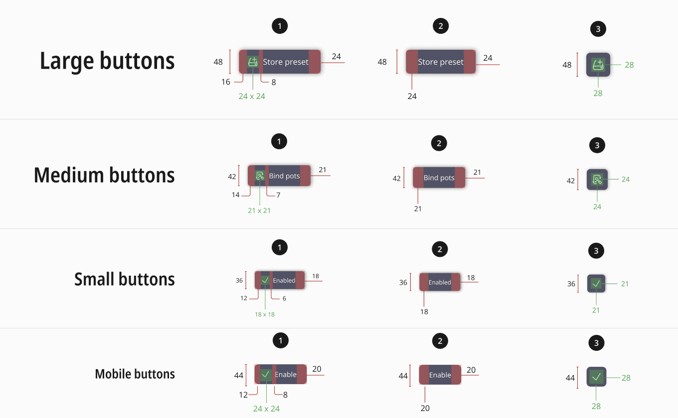
Scaling of buttons across platforms
Consistency Across Platforms
A consistent scaling strategy across both desktop and mobile ensures that visual elements and typography are coherent, providing a seamless experience for users who switch between devices. This coherence is key to maintaining a unified visual identity across the DG Suite.
Tokens: Building a Scalable and Adaptive Design System
To establish a consistent and flexible design framework for the DG Suite, I developed three core types of tokens: primitive tokens, semantic tokens, and adaptive tokens. These tokens ensure that design elements are easily scalable and adaptable across different contexts and devices, seamlessly linking design and development.
Token Hierarchy Diagram
Primitive tokens
Primitive tokens form the foundation of the design system, defining core properties such as colors and spacing. By assigning specific token names to colors and using “rem”-based spacing tokens, I established a consistent and easily implementable system across the suite. This approach not only simplified design decisions but also ensured that developers could quickly and accurately apply these elements in the codebase.
Semantic tokens
Semantic tokens contextualize primitive tokens, applying them to specific design elements. For instance, a semantic token might define a “primary button color” by referencing a primitive color token. This method ensures that design choices are consistent and relevant throughout the UI, maintaining a cohesive user experience.
Adaptive tokens
Adaptive tokens introduce flexibility, allowing the design system to respond to different user environments and screen sizes:
Light and Dark Modes: Ensuring visual coherence across modes.
Responsive Scaling: Adapting components and typography for various screen sizes.
Token Interaction
Token interaction of a Search Bar on Light mode and Dark mode
Primitive tokens establish the basics, semantic tokens apply them meaningfully, and adaptive tokens ensure responsiveness. Together, they maintain consistency and adaptability, allowing the design system to scale efficiently as the DG Suite evolves.
Impact on Development
Using tokens streamlined collaboration with developers, reducing errors and accelerating the design-to-development process. By providing clear, reusable guidelines, we reduced development time significantly and ensured that the design intent was faithfully executed across the suite.
Challenges and Solutions
One challenge was ensuring the correct implementation of tokens across the team. To address this, I developed detailed documentation, improving adoption and consistency throughout the development process.
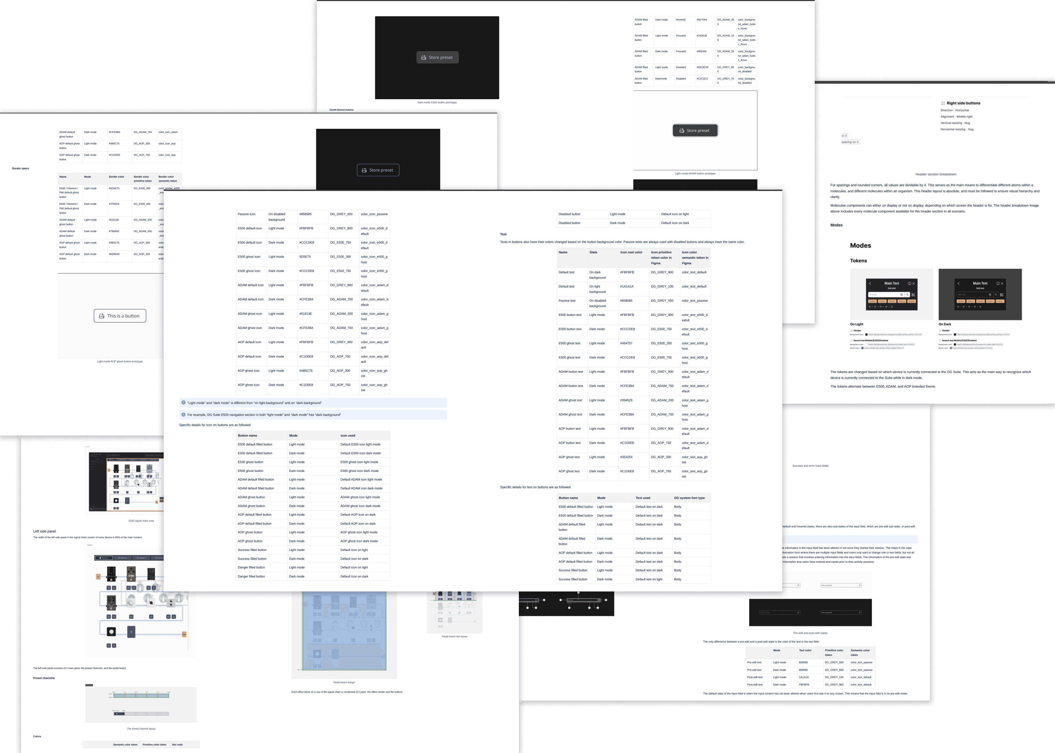
Documents on Design Tokens
Documentation are stored inside Darkglass Confluence internally.
Real-World Application
The adaptive tokens enabled a seamless transition from light to dark mode, maintaining consistent visual hierarchy and user experience across all devices. This approach not only enhanced usability but also future-proofed the design system for ongoing scalability.
UI Library: Creating a Cohesive and Reusable Component System
The UI Library for the DG Suite was designed using the Atomic Design methodology, ensuring that every element is modular, reusable, and consistent across the entire product suite. This approach not only streamlined the design and development processes but also enhanced the overall user experience by maintaining visual and functional consistency.
Atomic Design Principles
I utilized Atomic Design principles to break down the UI into its fundamental building blocks:
Atoms: The most basic elements, such as buttons, input fields, and icons. These are the core components that form the foundation of the design system.
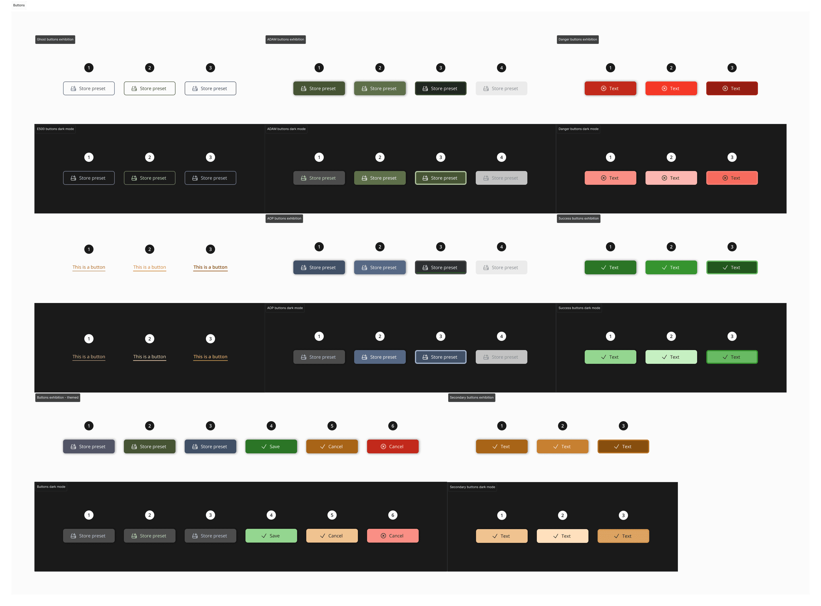
Different types of buttons as Atoms
Molecules: Combinations of atoms that function together as a unit, such as a search bar with an input field and an icon or a button.
Search Bar as a Molecule
Organisms: Larger, more complex components built from groups of molecules, like a modal or a header section.
Different types of Organism
Templates and Pages: Complete layouts that bring all these elements together, providing a cohesive structure for the DG Suite’s user interface.
Templates and Pages
Comprehensive Component Library
The UI Library is a comprehensive collection of reusable elements designed for both mobile and desktop interfaces. This library includes a wide variety of components, each with multiple variants to accommodate different use cases. Key components include:
Buttons: Multiple styles and sizes, optimized for different actions and platforms.
Buttons types and styles
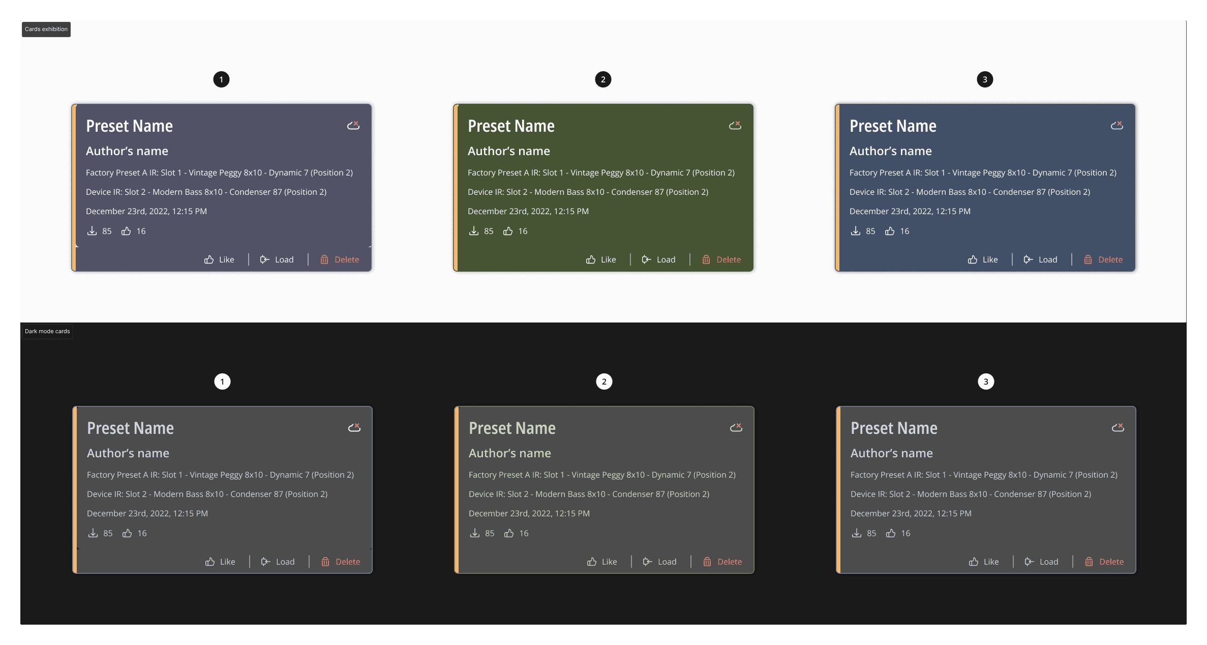
UI Cards: Customizable cards for displaying content in a structured format.
Default UI cards across all Darkglass Devices
UI card's behaviors
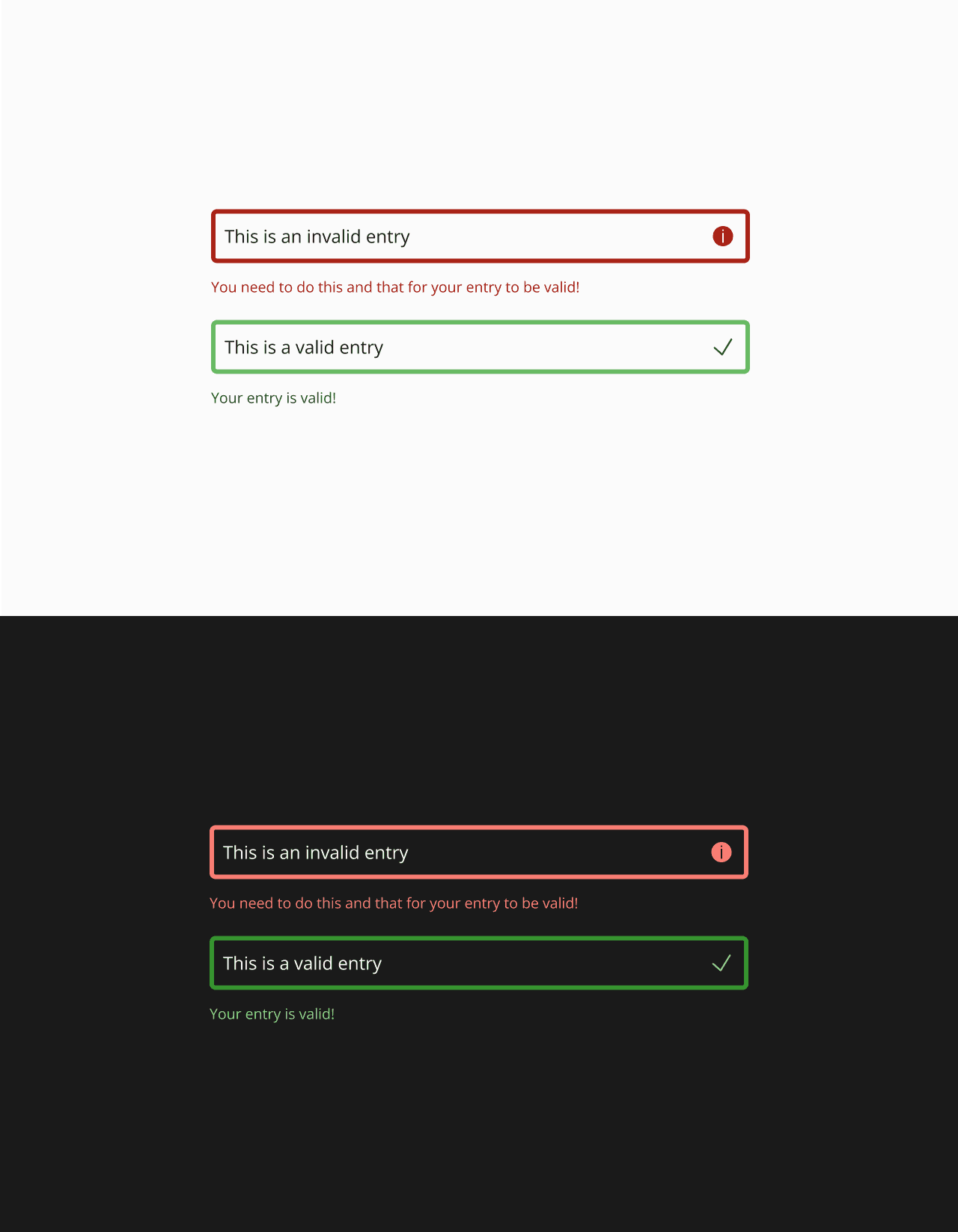
Input Fields: Standardized input fields with variations for different data types.
Input field examples
Snack Bars and Chips: Informative and action-oriented elements for notifications and quick actions.
Drop-down menu: for selections with multiple options
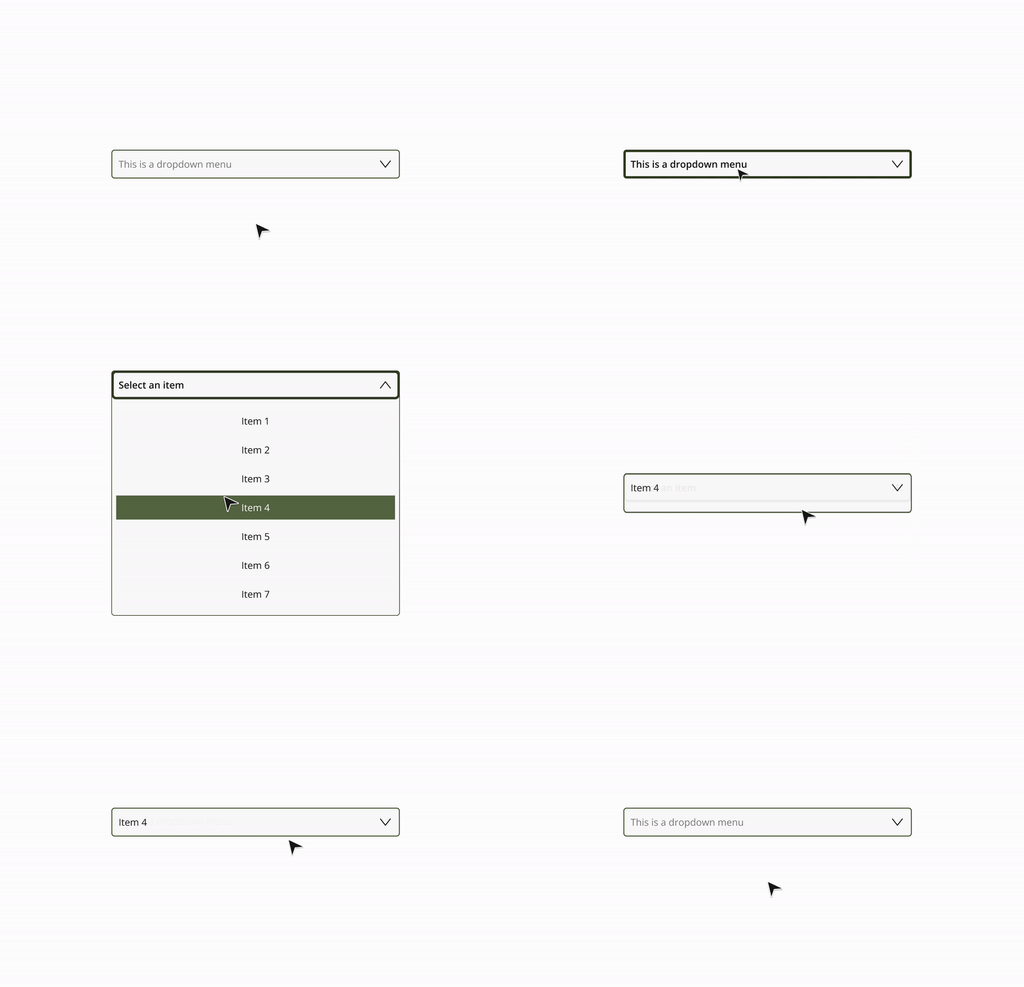

Dropdown menus
Cross-Platform Consistency
The UI Library was meticulously designed to ensure consistency across mobile and desktop platforms. Each component was tailored to work seamlessly in both environments, maintaining a unified look and feel throughout the DG Suite. This cross-platform consistency is critical for delivering a cohesive user experience, regardless of the device being used.
Efficiency in Design and Development
By creating a UI Library with reusable components, I significantly reduced design time and streamlined the development process. The library provides a single source of truth for designers and developers, ensuring that all elements are implemented consistently. This approach not only enhances collaboration but also accelerates the design-to-development workflow, reducing errors and iterations.
Impact on the DG Suite
The UI Library has had a profound impact on the DG Suite, enabling rapid prototyping, consistent implementation, and a more streamlined development process. The reusable components have improved the overall efficiency of the design and development teams, while also ensuring a consistent and engaging user experience across all touchpoints.
Final words
The first version of the DG Design System was created in response to the need for improved user engagement across the platform and to hasten the shift from concept to coding. Despite addressing immediate requirements, there was still considerable potential for improvement as the DG Suite continued to develop. As a result, the design system of the DG Suite would experience regular enhancements, especially when a thorough revamp becomes necessary.
